Fruit Stand Designer Series Paper

DSP Fruit Stand 1 wwm

DSP Fruitstand single wwm

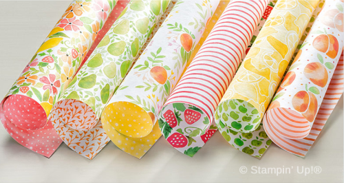
One of my favorite Designer Series papers in the Annual Catalog this year is the Fruit Stand DSP.  And even though we're heading into the season of more subdued colors, I still find myself being pulled back towards the fresh and happy colors of this delicious sherbet-inspired palette!  


141660G

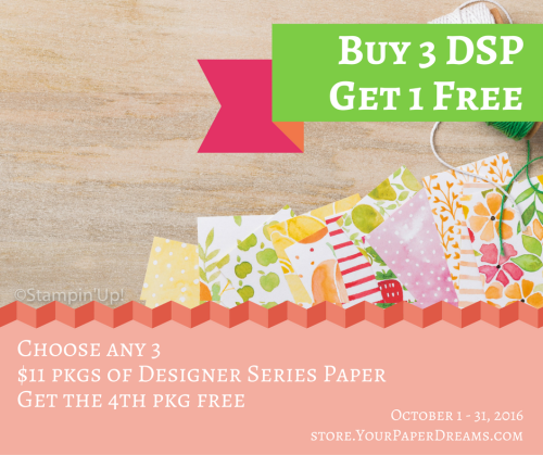
So lucky thing, isn't it, that during the month of October, for every 3 ($11 US) packages of Designer Series Paper you choose, you can get the 4th one FREE!?!


Buy 3, Get 1 free


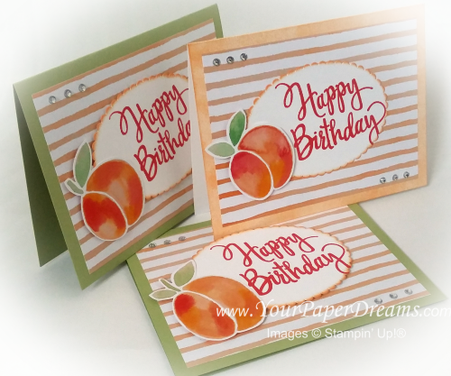
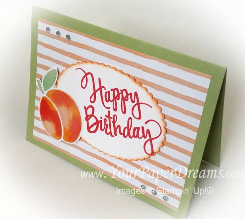
These cards were pretty darn simple to make. Two of the samples feature Pear Pizzaz cardstock for the base, and I used a sponge brayer to apply Peekaboo Peach ink onto thick Whisper White cardstock for the other one. I stamped "Happy Birthday" with Watermelon Wonder onto a piece of Whisper White, and then cut it out with one of the new "Layering Ovals Framelits". A little more Peekaboo Peach ink highlighted the edge.

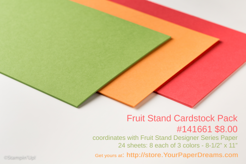
Fruit stand cardstock 2

The peach itself is just fussy-cut right from the DSP, and then both the oval and the peach are lifted up on Stampin' Dimensionals…. placed onto a piece of the very same Designer Series Paper (actually, the reverse side of the peaches). 

And then a bit of rhinestone bling, and it's done! Just THINK of how many fruit-filled birthday wishes you could make & send with just these very same products!

 Product List 

Designing with Bits and Pieces – Part 3

20160918_110821[1]-wwm

20160918_111918[1]-wwm


This is the last of the Bits & Pieces design session that I'll be sharing from my personal stamp-a-thon last weekend.  

Bits and pieces 3 wo arrows

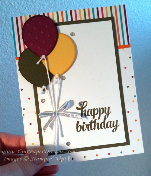
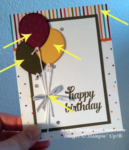
This one began centered around balloons because my scrap bag already held the Rich Razzleberry balloon (already punched and embossed), and it also had scraps of the two other colors of cardstock – each one just about the perfect size for a punched balloon. So the 3 balloons together quickly became my focal point….. but then I had to figure out where to go from there!

Further digging in my scrap bag turned up this scrap of striped Designer Series Paper (of the narrow-ish width you see here), and fortunately I was able to find a complementary piece of DSP (the polka dots) I could trim to go along with it. Placing the balloons directly on top of the printed backgrounds tended to wash them out, so the next 2 layers were born – to provide a simple white surface for the sentiment and focal point.

One more dive into my scrap bag brought me the silver bow, which I set off with a few rhinestones for a little extra bling. 

The arrows below show the 5 elements I was able to rescue from my "left-overs" scrap bag! Yee haw!!

Bits and pieces 3


Designing with Bits & Pieces

20160918_110821[1]-wwm


A little while ago I decided it was time to empty out and do something with some of the little "bits & pieces" I collect. You see, when I clean up my work space (which I seem to do far too rarely, but don't tell anyone, lol), I often find little leftover "bits & pieces" from a kit or Paper Pumpkin project I assembled, or some extra doo-dad from a card class I held, or something from a card design that got started once-upon-a-time and may have taken another direction – or just never got finished at all. So I keep a couple plastic bags on my desk and add those little tidbits to them at clean-up time.

So I decided recently it was time to pare down the contents of those bags a bit and see how I might actually USE some of those collected bits. I started by emptying out the bags and surveying what was there. (This is a partial sampling.)


20160918_111918[1]-wwm

From there, I started moving things around into little groupings of stuff that might go together…. whether by color and/or by theme – and several of those groupings eventually became the seeds for a card design.  I'll be highlighting some of the results in upcoming posts.

Here's the first completed card….. something that's been hanging around ever since last Christmas-stamping season. I've taken it out and looked at it from time to time during this past year, but just kept hitting a creative block. The concept had started out as a "black & gold" card. I remember being really excited about the somewhat different and elegant concept, and I'd made respectable progress on the card nearly a year ago - until I got totally stuck. Could NOT for the life of me figure out where it should go next! While the black & gold seemed pretty enough, it was just – well, boring.  I knew it needed a focal point, and that's the role the wreath was to play, but it still just wouldn't "work". 

So fast-forward nearly a year, and I finally figured out what the problem was. The volumes of each color where too similar….. often a no-no when planning a design. So I decided the answer might be to add a small amount of red for a bit of punch…… and here's what I ended up with.! I'm MUCH happier with it now!


20160925_155800[1]

20160925_155844[1]

Since this card had been "under construction" for the better part of a year, I didn't have to add much to it. As it turned out, I added a circle of Whisper White cardstock behind the wreath so the printed vellum underneath didn't show through…. and then I stamped and embossed the sentiment in red and fussy-cut its custom shape. Then I die-cut the bow from a scrap of red foil paper, and added a single rhinestone for bling. The arrows below show the only elements I actually added to what I'd started a long, long time ago! 

20160925_155722[1]

Stay tuned for more completed projects that have arisen recently out of my "bits and pieces" endeavor!

And in the meantime, if you're a FB friend and/or a regular customer of mine, I hope you'll join us for our 3rd annual World Card-Making Day Virtual Retreat! Hosted on Facebook, it'll be 48 hours of creativity and fun – from the comfort of your own home. (Although you DON'T have to be present for the entire time, of course!) So make sure you RSVP that you're attending (details are in the FB Event), and then gather up the goodies you plan to work with! And we'll see you in only a few more days!
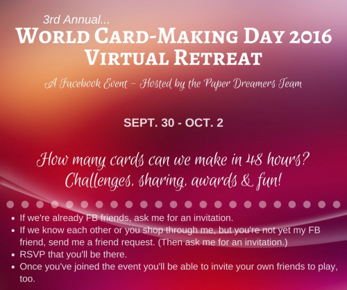
World Card-Making Day 2016 - FB promo

Thoughtful Branches – Redux

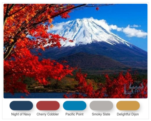
TAMS Color Builder (1)This is the most recent color challenge I've proposed in my Facebook groups. For my own card I knew I wanted to make a birthday card, but the colors were speaking to me more about "fall" than "birthday balloons" or the like. So I sucked it up and recreated this card – in new colors.

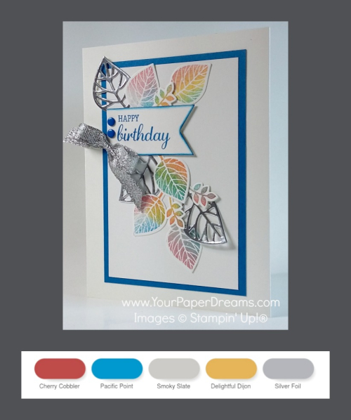
Using 4 of the 5 challenge colors, plus adding silver, I ended up with this:

Thoughtful Branches redux

Since most of these colors are quite bright (at least compared to the more traditional autumn colors of my original card), I chose to use sponges to apply the colors with this version – rather than the daubers of before. So this way I was able to soften the color intensity somewhat. But the larger surface of the sponges also meant more color-overlap, and I was reminded of a lesson I learned way back in elementary school: blue + yellow = green, lol!

I did, however, use one sponge dauber on this card – to apply the blue edge to the banner.

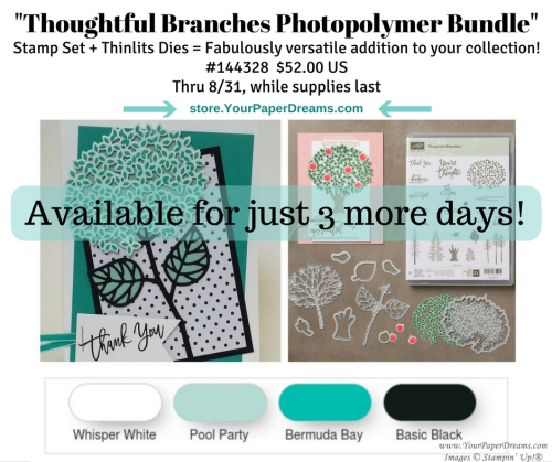
Now, as to the Thoughtful Branches Bundle (stamps & dies) that were *supposed* to be available only through the end of August….. well, at the end of August Stampin' Up!® announced they still had plenty in inventory, so they would continue to make them available while supplies lasted. And as of today, I see they're still in the online store! So if you haven't yet taken advantage of this amazingly gorgeous and versatile bundle, you're not out of luck – YET!  <<wink>>


Thoughtful Branches – Fall Leaves

20160826_170259wm

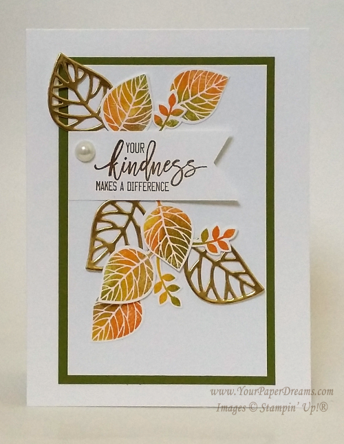
Yep, this time it's a fall card! Again, a "Lynda version" of a card that's been all over the 'net, and I loved the contrast between the die-cut lacy leaves and the solid, multi-color ones. Some versions of this card "out there" use a fun, but rather messy inking technique. But since I had designed my version for class, "messy" wasn't something I particularly wanted to tackle.

20160826_170259-562wm

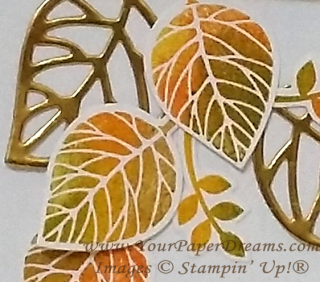
So here's how WE got a similar multi-color, autumn effect.  It's a pattern that you repeat for each individual image:


  • Start with a clean stamp. (Good idea to keep a damp paper towel handy.)
  • Ink up the stamp with Daffodil Delight, but do not stamp with it yet.
  • Lay out all your remaining leaf color inks in order from light to dark, left to right, and have a sponge dauber at hand for each one. (At my class we laid out Pumpkin Pie, Old Olive & Soft Suede.)
  • Onto your yellow-inked stamp, "daub" (is that a real word?!?) a couple of other colors directly onto small areas of the stamp….. one at a time, and always working from lightest to darkest. So because of the order we'd laid out the inks, that would mean Pumpkin Pie followed by Old Olive, OR Old Olive and then Soft Suede.  Pay attention to where you daub each color on the stamp so you don't overlap sections entirely.
  • Once that was done, there would be 3 colors on the stamp (Daffodil Delight + 2 others), and after "huffing" on it, it was time to stamp the image (onto a scrap of Whisper White cardstock).
  • Clean the stamp and get ready to repeat the process for the next leaf.

We stamped (and then die-cut) enough of these colored leaves for not only the front of the card, but also one or more for the inside, too. 

And we followed the same process for those little "flowery-leafy-thingies", too. 

After layering up the main pieces on the card front, we made the banner with the sentiment and anchored that in place…..

And then the lacy-leaves (cut with the corresponding stem-and-leaves die from this bundle – from Gold Foil paper) were laid in place to give a general shape to the layout. And finally, all pieces were tacked down with either strategically-placed dots of glue from the Fine Tip glue pen or the Tombow Multipurpose glue. (Repeat after me, Lynda's cardinal rule of glue-use:  "Less is more. Less is more. Less is more!")

A large (retired) pearl finished it off (and ensured it would cost an additional 21-cents to mail)!

Fall leaves card

Thoughtful Branches – A spring/summer hydrangea

2

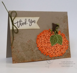
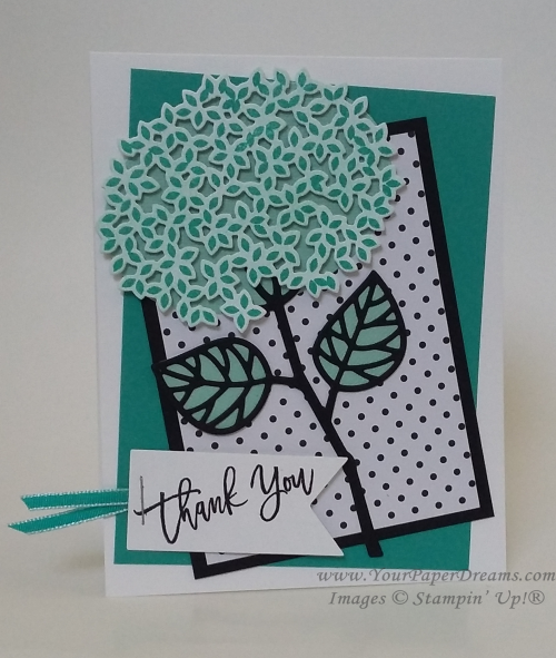
At my card classes earlier this month we capitalized on the versatility of the Thoughtful Branches Photopolymer Bundle and stamped up cards representing spring/summer, fall and winter. (See an additional fall card here.) Today I'd like to share our spring/summer card. Isn't it fascinating how the same stamp/die combo turned one way and stamped in orange can be a pumpkin….

20160826_170500-800wm

 yet  flipped over and stamped in a different color becomes a hydrangea?!?  Yes, I do believe this bundle from Stampin' Up!® is truly one of the top most creative and versatile they've produced. And I'm so sad that in only 3 more days it will go away. 

20160826_170354-wm

The color palette for this card is simple and fresh - generally monochromatic with its Whisper White, Basic Black, Pool Party & Bermuda Bay. The basic idea was something I'd seen online, but then I added my own tweaks, including the jaunty angles of the layers for an extra punch of fun.

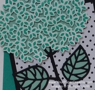
For the hydrangea, we first tinted a piece of Whisper White cardstock a light shade of Pool Party with one of our new sponge brayers.  Then stamped over that with Bermuda Bay before die-cutting that wonderful lacy shape. Then layered that piece over an oval (of Pool Party cardstock) to provide the sense of dimension…. just as I'd done with the pumpkin.

20160826_170354-800wm

The stem & leaf were die-cut as well (Basic Black), and the stem adhered to the underneath oval with tiny spots from the Fine-tip glue pen. To back the leaves, we traced the shape of the die itself onto scraps of Pool Party and cut them out by hand before adhering behind the detailed black layer. The black polka-dotted layer comes from Pop of Pink Specialty Designer Series Paper, a HOT DSP package found in the still-newish annual catalog. (You can never have too many polka dots, can you? And when they're black they go with EVERYTHING!)

And here's a fuss-free tip for cutting a banner exactly the right length for your sentiment:

  1. Cut a piece of cardstock as wide as you wish your finished banner to be, and plenty longer than you want its finished length to be.
  2. Notch one end with the Banner Triple Punch.
  3. Orient the notched edge according to your ultimate design, and stamp your sentiment close to the notch.
  4.  Then clip off any extra length – to yield a perfectly-sized stamped banner!

Stay tuned for the "fall" and "winter" examples -  from our card classes earlier this month!

  Product List


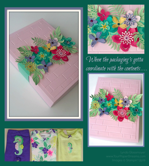
When the packaging’s just gotta coordinate with the contents

Packaging collage

I had occasion recently to wrap a baby gift. Now, this wasn't just some random baby gift, but rather, in celebration of the upcoming arrival of my 2nd granddaughter. So if there's ever a reason to spend a little extra time wrapping something, I figure that that would qualify. I'd picked out this adorable little 3-piece set – 2 onsies and a coordinating pair of pants/leggings. Yes, I know the pant legs will be too long; manufacturers have had DECADES to figure out babies' legs aren't proportioned to the rest of their bodies yet, but for some reason they refuse to adjust accordingly. But I digress. I had this cute little clothing ensemble and it needed to be wrapped. Appropriately.

So the first thing I reached for was cardstock in colors close to those of the clothes. Minus purple, of course; I already knew that wasn't
gonna happen. But I was Botanical-Builder-Box-close-up-800-wmsurprised to see how tough it was to match the other colors, too! Especially a yellow-green. Came up empty-handed there, too. But eventually I ended up pulling out some scraps of retired In Colors: Strawberry Slush, Pistachio Pudding and Coastal Cabana…… and then added Bermuda Bay, Pink Pirouette, Wisteria Wonder and So Saffron to round out my options. 

To determine the size of the box I folded (and refolded) the 3 items until I
could stack them up into a size I could create a box for (using only 8-1/2" x 11" cardstock, 'cuz that's what I had available). Luckily, I determined I could do that with a box 5-1/2" x 7-1/2"….. and 1-1/2" deep. YAY!  So I just trimmed a half-inch off the bottom of a full sheet each of Wisteria Wonder (for the box bottom), and Pink Pirouette for the box top. (Leaving me with 8-1/2" x 10-1/2".) Scored 1-1/2" borders all the way around for the bottom, and just the teeniest smidge narrower for the top.  (This technique leaves the box top just that itsy-bitsy bit larger so it'll fit over the bottom.) 

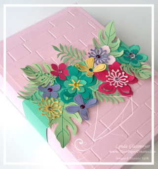
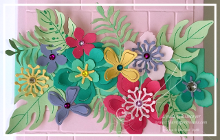
Botanical-Builder-Box-800-wmAfter assembling the box I determined that that much surface looked just a little bit  "flat", so I added a layer using the Brick Wall embossing folder. Figured that made a decent base to work with, and the fun was about to begin.

Now, I have to confess that I love flowers (DUH! Those of you who know me aren't surprised, are ya?), and after 20 years of working with flowers in the paper and ink world I've figured out it's not likely I'll ever tire of them. And whenever I can combine flowers with DIMENSION, so much the better. So it's really no wonder the Botanical Builder Framelits have become my "go to" faves these days. 

So this is the result. I shaped the flower petals and leaves with a bone folder and also wrapped some elements loosely around a white gel pen. (Ugh! Just realize that's been retired. YIKES! How'd I miss that?!?) All the flowers are glued to a belly band that simply slides off to open the box. I love belly bands on boxes for this purpose; you can get as elaborate as you want with the decoration, and yet nothing has to be untied or otherwise destroyed when it's time to access the box's contents.  A perfect packaging solution in my book!

Buy NOW, get a coupon for NEXT month!

Now here's something ELSE really cool! Right now (and through the remainder of July, actually), for every $50 of product you order through me (at one time, that is), you'll get an emailed coupon worth $5 towards product(s) you order NEXT month. (Specifically Aug. 2 – Aug. 31 .) And there are no limits as to how many $5 coupons you can accrue; you'll get one for every $50. So for instance, if you like the Botanical Builder Framelits AND the coordinating Botanical Blooms Stamp Set I've used on this project, well, guess what?! ? Conveniently, they both add up to $50, and BOOM! you've earned a coupon to spend next month! Or choose $150 in product (ordered at one time) and get not only THREE $5 coupons for next month ($15 value, that is), but also $15 in Stampin' Rewards THIS month, too! Get the idea?!?

Here are the products I used on this project; items that are currently available (at time of this writing) will link to my online store:
 

Strawberry Slush 8-1/2" X 11" Card Stock

Strawberry Slush 8-1/2" X 11" Card Stock
[131295]
$6.95
Pistachio Pudding 8-1/2" X 11" Card Stock

Pistachio Pudding 8-1/2" X 11" Card Stock
[131294]
$6.95
Coastal Cabana 8-1/2" X 11" Card Stock

Coastal Cabana 8-1/2" X 11" Card Stock
[131297]
$6.95
White Signo Uni-Ball Gel Pen

White Signo Uni-Ball Gel Pen
[105021]
$4.00


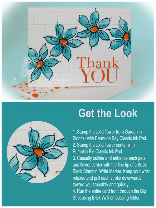
Garden in Bloom meets Fun Frames

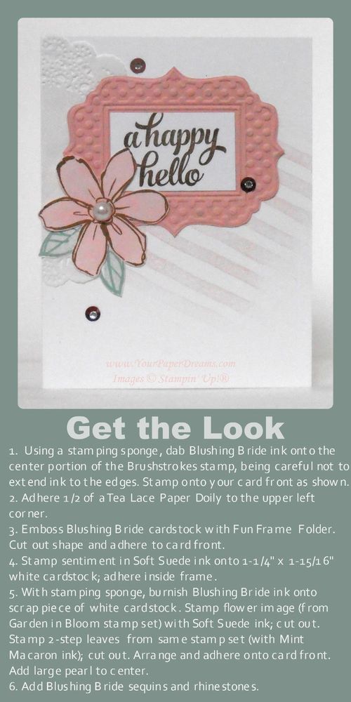
Get the Look - Garden in Bloom meets Fun Frame

One of today's trendy looks is creating a focal point from a grouping of individual elements. Often, the sentiment is included as one of those grouped elements, and there may also be subtle texture or other visual interest in the background. This card features all of those.

Those who've been following me for a while know that some of my favorite techniques involve applying ink in non-traditional ways. This card features two such examples.

The diagonal lines of the background represent the first such technique. To get that look, I inked a stamping sponge (just by pouncing it on the Blushing Bride pad), and then dabbed it onto the center portion of the Brushstrokes stamp. I was careful to avoid extending the ink as far as any of the edges of the stamp, as that would give a harsh edge when stamped. Rather, what I was looking for here was a softer, more cloudy look, where the inked image just kind of fades in and out. Once the ink was applied, I stamped the background at that jaunty angle for yet more visual interest.

Another favorite way I like to use ink a little "out of the box" is when I want a piece of colored cardstock that's more subtle than the intense colors of our regular cardstocks. In this case I wanted a Blushing Bride flower, but a much softer shade of it than the Fun Frame it would be backed with. So I just burnished Blushing Bride ink onto a scrap piece of Whisper White cardstock with a stamping sponge before stamping the flower image onto it. (My version of "burnish" is to rub ink down into the cardstock in a circular motion. I actually do try to rub the ink right into the cardstock, so I start with a light hand and then get firmer and firmer as I rub in circles. Every time I reload the sponge from the ink pad I am careful to tap my sponge off once or twice onto my scratch paper so I don't accidentally get a "blob" of ink when I first touch the paper I'm working on. You can always add more ink, but can't take it away if you get a "blob", ya know.) So once I decided I had the color intensity I wanted for this, I just stamped the flower image (from Garden in Bloom) right onto my newly-colored paper and then fussy-cut it with Paper Snips.

The leaves are stamped in the more usual 2-step method this stamp set was designed for….. and then also fussy-cut.

When I first introduced this card at card class last month several of the ladies groaned at the assumption they'd have to cut out the center section of the embossed Fun Frame. But no worries there; it's just it's own layer of Whisper White cardstock (1-1/4" x 1-15/16") – stamped and applied on top of the frame! Easy-peasy!

Even though none of these elements is popped up on Stampin' Dimensionals I still wanted to retain a suggestion of depth anyway. So I only applied adhesive to the center areas of the frame, doily and flower, leaving their outer edges free.

Oh! And a tip for applying the sequins: place a tiny dot of Fine-tip Glue where you want the sequin to be, then lay the sequin right over it. Remember – that's a "TINY!" dot, in order to avoid a glue smear!

Don't you think this same general layout would be fun to work up into a Christmas card? I'd love to see your examples if you do that!


Product List

Garden in Bloom meets Freehand Drawing

Garden in Bloom meets freehand tutorialHere's a fun way to get a big bold look in practically no time at all! I'm loving the new THICK Whisper White cardstock these days – for cards that stand bold and proud on their own, without having to use multiples layers of cardstock to give them some heft. So this one was literally just stamp, outline, and emboss. Done!

Limiting the colors to just 2 keeps the attention focused right where you want it….. on the images and your freehanded line work.

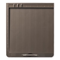
Don't forget to use a Stampin' Pierce mat under your paper when stamping with Photopolymer!

Product List

Monochromatic Welcome Cards

P8060057-web

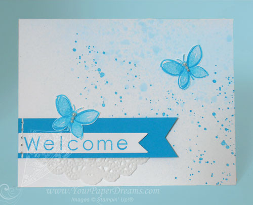
Today I've been working on welcome cards for some new team members. Since Tempting Turquoise is our Paper Dreamers' team color, my welcome cards always feature that color – usually in a monochromatic theme.

For today's cards I started by spritzing a rubbing alcohol & ink-refill combo onto a section of the card…. deliberately leaving the upper left corner white to give the overall look some intentional "white space". That dried pretty quickly, and then I added the more distinct spatters with Gorgeous Grunge. The 2-step butterflies (from Garden in Bloom) were stamped onto another piece of Whisper White cardstock and then fussy-cut to maintain their true white backgrounds. Faux stitching anchors the end of the banners and self-adhesive pearls finish off the butterflies.

Here's how I got the "Welcome" letters aligned.

 Product List