First play with Christmas Barn Bundle

First play with Christmas Barn Bundle
Christmas Barn Card 2

Christmas card featuring Christmas Barn Bundle

I’ve just been dying to dig into this Christmas Barn Bundle that I purchased a few months ago, but hadn’t yet had the opportunity to use. Thankfully, I finally found the time recently! 

This bundle (stamps + dies) has so many appealing images it took me a bit longer than usual to figure out an arrangement that reflected what I had in my head. I loved the barn, but pretty quickly realized that if I wanted to use the horse & sleigh, the pond, AND several trees… that there just wasn’t going to be room for it all on a standard-sized card. So the barn will have to wait its turn.

This is a standard 5-1/2″ x 4-1/4″ card. Its base features the thick basic white cardstock, which is my standard go-to for most of my card bases. I cut the snow hill at the bottom freehand from a scrap of Shimmery White cardstock, and the snowflakes were then die-cut from the remnants of that same scrap. 

To get the dual-color look for the trees, I began by inking the stamp with Soft Succulent Classic Pad, but then immediately added the brown color to the trunk & branches with my Early Espresso Stampin’ Write marker, applied directly onto the stamp. (Note: this is ok to do with our Stampin’ Write markers because they are water-based and will easily wash off the stamp; but do NOT try this with the Blends, however, as they are alcohol-based and not intended to be used directly on stamps.) Anyway, once the Stampin’ Write marker color was applied to the stamp, I breathed some warm, moist air onto the stamp and immediately stamped it onto the card.


Balmy Blue Classic Pad provided the 2 blue areas on this card: the sky and the pond. I used a Blending Brush to apply ink to each area, varying the intensity of the ink accordingly.

The sleigh & horse were stamped with the black Momento pad, and then colored with several Stampin’ Blends colors before die-cutting. And that image, along with the fence, was then mounted with Stampin’ Dimensionals. 


For final touches, I stamped the sentiment that appears at the bottom onto scrap cardstock, and cut it out freehand. And then added a bit of twinkle to the top edge of the snow hill, as well as to the snowflakes with my Wink of Stella Glitter Brush.


And just like that, my Christmas Barn Bundle has now been broken in!

Christmas Barn Card 1

Want some or all of these supplies for yourself?

Just find the “Add All to Cart” button down below the images. This will add each of these items to your cart at Stampin’ Up!’s online store and then take you directly to the store and show you that list in your shopping cart. Then just go down that list and simply delete the things you *don’t* need, and adjust the quantities you *do* need! Be sure to log into your own account to check out, or save the contents of your cart to purchase later. Easy-peasy!

NOTE: In addition to these items shown, I also used a variety of Stampin’ Write Markers, and Stampin’ Blends to color the finer details.

Whale of a Time Birthday Card

Whale of a Time Birthday Card

So recently, I was invited to an (under 10 people) family gathering to celebrate July birthdays. And it just so happens that the day before, I’d received the new, bright and cheerful “Whale of a Time” suite, and I was very much itchin’ to dig in and start working with it. So here’s what happened…

About this card...

The finished size of this card is 5-1/2″ square. It’s been a long, long time since I’ve made a square card… likely because I have no square envelopes left of the required size, and the envelope maker tool has retired, too. And I couldn’t remember how to measure and make an envelope out of other paper.   (Great reasons to refrain from making square cards, huh?)

Fortunately, after a half-hour or so of fumbling around, I was able to remember (or reinvent; not sure which is more honest) how to make a custom-sized envelope from some coordinating DSP using my Simply Scored board and its diagonal insert (the latter of which is also retired; I just happen to still have mine).

But back to the card itself...

The front of the card is a delightful piece of 6″ x 6″ Designer Series Paper (DSP) from the suite, trimmed down to 5-1/2″ square, and mounted onto a folded piece of 5-1/2″ x 11″ Whisper White Thick Cardstock. I hated to have to trim the DSP at all because it was so lovely in its original state, but I just trimmed off little slivers at a time so as to maintain its visual balance around the edges.

Then I stamped the fishes (Terracotta Tile) and turtle (Shaded Spruce) directly onto the DSP. I stamped the whale (with Blackberry Bliss) onto scrap Whisper White cardstock, and punched out that image, along with 3 additional layers. Then stacked them all up and glued them all together to give the whale a little more dimension without having to resort to Stampin’ Dimensionals. For the water spouts above his head, I applied some Blackberry Bliss ink to a remaining scrap of white cardstock with a dauber, and then punched out the droplet shapes. All the punched pieces eventually got adhered to the DSP with Multipurpose Liquid glue, and that whole element was adhered to the card front. 

Whale of a Time

For the inside...

I decided to decorate the entire 11″ length, using images from the stamp set, in colors from the DSP. If you look closely, you may see that I used a foam brayer to add Balmy Blue to the lower 2/3 of the whole surface, starting at the bottom edge with each stroke and pulling upwards to yield a decreasing intensity of color moving upwards.

All-in-all, I absolutely adore this suite, and particularly the DSP! (Which I just about need a 2nd pack of already, lol.)

If you cuncur with the “adorable-ness” of this suite, go check it out beginning on page 94 of the 2020-2021 Annual Catalog.  And you can purchase the various elements individually at my online store. (Once in the store, just enter “Whale of a Time” in the search bar.)

Coastal Weave Embossing Folder Meets Peaceful Poppies

Coastal Weave Embossing Folder Meets Peaceful Poppies

What a Month!

Wow! The last day of May already. Hard to wrap my head around all that’s happened this month (both good and bad), but I’ve been mighty grateful to have had access to the internet and various online services so I can continue to be active with and enjoy my Stampin’ Up!® business!

This month I upgraded my video lighting for a “bit” better look for my online presentations. But I think I may have had a little higher expectation from my new lights than they’ve delivered; somehow new lighting hasn’t entirely eliminated the fact that I’ve been a demonstrator with this company for 24 years, and well, I look at least that many years older in front of the camera. That I have a growing number of wrinkles and sags in places I’d rather not have. That my “quarantine hair” is much too long and much too gray. And that my tiny poorly-lit apartment is…. well, a tiny poorly-lit apartment.

But nonetheless, I’ve had a lot of fun this month connecting with my stampin’ friends while presenting 3 online events… beginning with my 3rd monthly template-based card class via Zoom, and then followed by 2 more events which were live-streamed to my Facebook page. None of these were flawless, but I’m learning to cope with the unexpected and “oops-es”… and not die of embarrassment. (Can we say “open mic” during yesterday’s intermission?!? Now the world knows I talk to myself when designing, lol.) So I choose to chalk up the flub-ups to “learning”.  And I truly appreciate all in the Paper Dreamers community who seem willing to accept the imperfections as I learn all this new tech stuff… and participate in these online activities anyway! Thank you from the bottom of my heart!

Mystery Card Class - Episode 1

Coastal Weave Embossing Folder Meets Peaceful Poppies

This was the 3rd card I created during yesterday’s inaugural presentation of “Mystery Card Class”, which was live-streamed to Facebook. The concept for this class is to follow along with some specific guidelines for making a card of your choice, while trying to resolve the “mystery” that looms in the background. And the clues to the mystery will eventually appear in the cards that participants stamp and post online for the viewers to see. 

I’d sent out prepared card kits to several stampers in advance, and invited them to participate in this event by assembling their cards and sharing them with the other class participants. But unfortunately, that plan kinda fell on its face because only 1 card got made up and shared. So we’ve had a significant shortage of “clues” (as compared to what I’d envisioned), and therefore yesterday’s mystery stands a good chance of remaining unresolved, and the intended prize not awarded. 

Ah! But I don’t give up that easily. I’m up for trying again next month, and hopeful that we might get broader participation. And if you receive one of the card kits I send out for Episode 2, please do play along by making up your card and showing us the result. The more participation this event can get, the more fun it will be!

I can't believe Coastal Weave Embossing Folder is retiring already!

This particular embossing folder has become my very favorite during its short life, and I’m really going to miss it. So when it came time for designing cards for yesterday’s class, I *had* to give it yet another workout before bidding it farewell.

So I ended up using not only my current favorite embossing folder, but also one of my very favorite techniques… applying and blending inks with various types of applicators. For this background, I began with a piece of regular Whisper White cardstock and embossed it with the soon-to-be-retired Coastal Weave 3D embossing folder.

Then I went after it with several ink colors, applied with Sponge Daubers… gradually building up light layers of Rich Razzleberry, Poppy Parade, and Blackberry Bliss classic inks until I had the look I wanted. I deliberately tried to vary the intensities of each color in different areas so the color wasn’t entirely even throughout.  I’m always thrilled to watch what develops when applying layers of color this way, and given that I was working with some of my favorite colors, I got more and more excited as the overall look developed! 

Once I had the general look I wanted, I went back over it with the Frost White Glimmer Paint (also applied with a sponge dauber) to give it a sheen. (Which may or may not show up in the pictures.) 

Additional supplies I used include Rich Razzleberry, Blackberry Bliss, and Whisper White cardstock, several sets of dies, various elements from the Peaceful Poppies Suite, and some retired trim & accessories I found while digging through my stash.

If you still need to add the Coastal Weave 3D Embossing Folder to your own collection, it’s still available in my online store, and as long as supplies hold out, will be for 2 more days… thru June 2nd. Grab yours here.

And be sure to bookmark my calendar page so you won’t miss what’s coming up!


“Painted Poppies” Valentine Cards

“Painted Poppies” Valentine Cards
Valentines wtih Painted Poppies
"Painted Poppies" Valentine Cards

Today I’ve got some serious monochromatic pink for you, in the form of “Painted Poppies” Valentine Cards. ‘Cuz what says “Happy Valentine’s Day” better than hearts and flowers, right?

Both of these cards feature Melon Mambo and Whisper White, along with some of what I consider the most basic dies that we should probably all have in our collections. And, of course, my current favorite stamp set, “Painted Poppies”. 

die-cutting-basics
Are you missing any of these basics? Sale-a-Bration is a smart time to update your collection of dies because you get to choose free product(s) with every $50 you order!

Can you find all the places I've used "Painted Poppies"?

20200214_111014 wo wm
Images © Stampin' Up!®
20200214_110923 wo wm
Images © Stampin' Up!®

And this card is basically the same, except the Whisper White and Melon Mambo of the large heart are reversed, and the inner heart is then stamped with an additional image from the “Painted Poppies” stamp set. 

Want more details about these cards? Be sure to order your Painted Poppies stamp set (or bundle) by Saturday, Feb. 15 (that’s tomorrow, btw), in order to receive the package of tutorials I’ll be sending out after that! Contact me to place your order for you, or submit it yourself at store.YourPaperDreams.com. (Current host code is always at hostcode.YourPaperDreams.com)

YOUR favorite moods of the “Painted Poppies” stamp set?

Have you ever thought about the many moods of the “Painted Poppies” stamp set? This delightful set of images, featured on the front cover of Stampin’ Up!®’s 2020 spring catalog, as well as on pages 24- 27, can confidently step up and shine for almost any occasion: birthday, anniversary, thank-you, friendship, invitation, wedding, sympathy, congratulations, and on and on! Dress it up, or leave it simple. Make it shout, or let it whisper. 

The next time you’re ready to create a card, friendship gift, scrapbook page, or even some home decor, there’s a really good chance that Painted Poppies can lend a hand.

The "understated" mood of "Painted Poppies"

Painted Poppies #simplestamping
Just stamps, ink and paper. #simplestamping
20200114_200104 - w wm
Step it up with a bit of layering, some masking, ribbon & rhinestones.
stepped up Painted Poppies
Step it up again. This time I added a die-cut poppy and leaves for interest & dimension, along with a fussy-cut bottom border that offers a glimpse of the sponging inside.

The "feeling pink" mood

20200125_205157 - w wm
A Valentine gift for a special someone
moods of the Painted Poppies stamp set
A little vintage look, anyone?
Painted Poppies cling stamp set

Free tutorials with purchase of "Painted Poppies"

Check back in a couple of days for some additional moods of the “Painted Poppies” stamp set. And in the meantime, why not grab your Painted Poppies (or even the Bundle with its coordinating dies) right here, so you’ll have everything when you’re ready to use it. 

I’ll be sending out a set of tutorials featuring some of the samples in this grouping (and the next) to everyone who purchases a Painted Poppies stamp set (or Painted Poppies bundle) through me by February 15th! And yes, if you’ve already purchased yours thru me, that order counts, too. (Tutorials will send AFTER the 15th, tho, because I’ll send them all at once to everyone who qualifies.)

Oh! And don’t forget that the Painted Poppies bundle will also qualify you to select a free item from the Sale-a-Bration brochure, too!

Lovely Lattice Stamp Set meets Stampin’ Blends

Lovely Lattice Stamp Set meets Stampin’ Blends

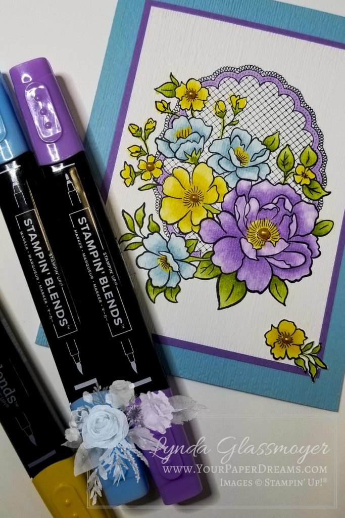
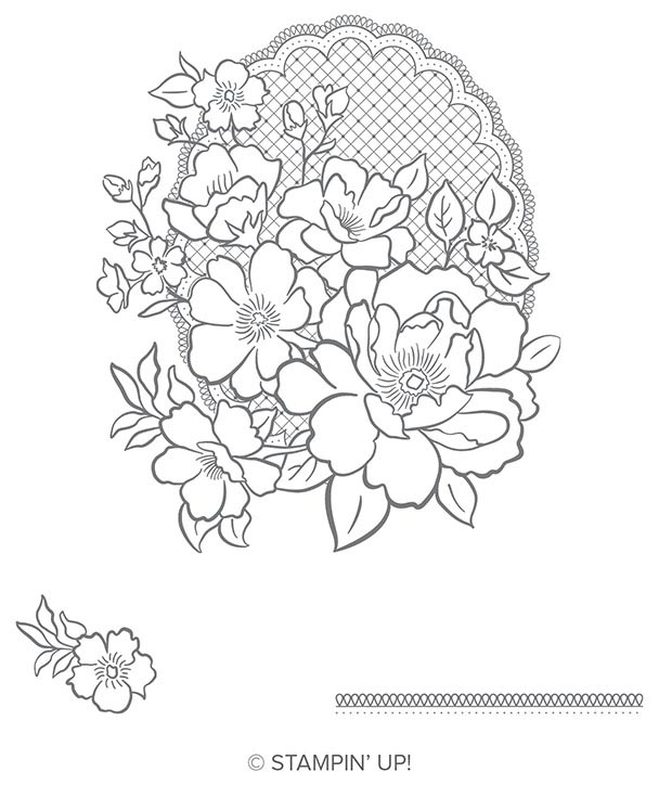
One of my favorite “Freebie” choices from the 2019 Sale-a-Bration (going on now through March 31) is the stamp set “Lovely Lattice”. And when it’s brought to life through the magic of Stampin’ Blends, well… now there’s a match totally made in heaven!

Lovely Lattice – Choose this stamp set for FREE with a $50 product order during Sale-a-Bration 2019. (Thru March 31, while supplies last.)

I was almost sad to see this card completed. Coloring in an outline image isn’t all that far off from the days of crayons and coloring book pages – elements of a relaxing past-time I have never really outgrown. So when my eye warned “That’s enough, Lynda; it’s done”, my heart wasn’t quite ready to cooperate. Nevertheless, I reluctantly put down my grown-up crayons and tended to final assembly.

“You can never have too many flower sets (in your stamp collection).”

– Lynda Glassmoyer

Those who know me, know I’m a sucker for flowers. And it certainly shows in my stamp collection! But why not? Flower images are appropriate for (almost) any card-giving occasion, and in this case, I didn’t even have a concrete idea yet for where this card was headed. I had no one specific in mind to receive it, and figured I’d just leave the outside free of any particular sentiment that could limit its use later on.

Getting the look

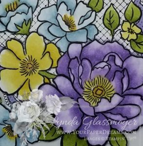
I began this card by stamping the largest image in the stamp set with Memento Tuxedo Black ink – onto Whisper White cardstock. And then used Stampin’ Blends in both light and dark shades of the following colors to bring it to life:

And a little touch of Pumpkin Pie in some of the flower centers. Then I created the highlights with the Stampin’ Blends Color Lifter.

Lovely Lattice colored with Stampin’ Blends

At this point, I realized a touch of dimension seemed in order. So I took that entire stamped & colored layer and ran it through the Big Shot inside the “Subtle” embossing folder. (BTW, that folder is right up there near the very top of my faves at the moment!)

3D Dynamic Textured Impressions Embossing Folder – “Subtle”

Then I added the same embossing to the front half of the Balmy Blue card base. I mounted the stamped & embossed layer onto an un-embossed layer of Highland Heather, and then adhered those layers onto the card base. The textural difference between embossed layers and those without embossing seemed to strike just the right contrast.

The final details

But it still needed just a bit more dimension. So, grabbing one of the Pumpkin Pie Stampin’ Blends, I quickly transformed a few “plain-ol‘-white” pearls into coordinating flower centers and added those to some of the flowers.

And that little flower down in the lower right corner? It was stamped onto a scrap of Whisper White cardstock, colored in with the same Blends markers, and then fussy-cut and positioned for visual balance.

Did you know that if you were to order all the Stampin’ Blends I’ve use here, and toss in the “Subtle” embossing folder, you’d qualify to get this lovely stamp set for free? Get all the goodies here.

Featured products

Snowflake Showcase – Last call

November's exclusive "Snowflake Showcase" has certainly been an amazing collection, hasn't it? So many beautiful snowflakes and versatile images – in both stamp sets and dies; I'm super-sad to see it coming to an end. But yep, today's its last day of availability; the curtain falls in just a few more hours.

In the meantime however, I thought I'd share some of the thank you cards I've been sending out recently. Featuring… well, what else, lol?!? Not only some of my favorite winter-time images, but some of my very favorite winter colors, too!

20181125_113855

Besides the "Snow is Glistening"  and "Kindness & Compassion" stamp sets, these cards feature "Layering Ovals" dies; Highland Heather, Gorgeous Grape and Coastal Cabana inks; Frost White Shimmer Paint; Clear Rhinestone Jewels; and Highland Heather, Gorgeous Grape, and Whisper White cardstocks (WW in both regular and thick). And of course, the Stamparatus helped place that "Thank you" image exactly where I wanted it… nice and bright!

20181125_113125

There are still a few remaining hours to claim all or part of this collection for yourself. If you're still debating, let me help. The answer is "Yes!" – because snowflakes of this classic art style will never look dated, they can be used solo or in conjunction with other images on almost any winter project, and look fabulous in pretty much any color. (Well, maybe not so much Real Red or Cajun Craze, come to think of it….. but YOU know what I mean, lol!) 

See what's still available from the Snowflake Showcase here!

Color Your Season – Part 5

20180817_151805

Only 3 days left for availability of this exclusive, limited-edition stamp set, dies and watercolor pencils collection, and I've still got 2 samples to show. Yikes! I've had the samples ready for a long time, but have been particularly tied up with personal life stuff this past couple of weeks. But I'd better get on the ball to meet my goal of showing 6 cards while these products are still available, huh?

This one features 2 of the 3 dies that have those lovely stitching marks around not only the inner edge of the die (as shown in this example), but they're also on the negative part of the die (so they'd show up along the edge of a window or frame, for instance). Honestly, I think these particular 3 dies are SO versatile and beautiful they're worth the price of the entire die set!

For these flowers, I pulled out my Stampin' Blends and had some fun. Now, I'm admittedly not the most skilled "stampin' blender" around (lots of practice still needed here), but I do enjoy using them. And I particularly love how easily and quickly you can apply color with them. You'll also notice I did a bit of "cut and paste" with the flowers, too. Meaning, I stamped, colored and then "fussy" cut and rearranged flowers and leaves to my liking. I like how splitting the 3 flowers into 2 groupings provides a nice balance to this layout.

To add a touch of additional visual interest I added some splatter to the background of the card base using an aquapainter dipped in ink. (But if you have a really keen eye you'll notice a wayward spatter just above the words. Oops! Apparently, I didn't have those extra pieces set quite far enough away from the splatter action, lol!)

If you don't have this amazing set of stamps, dies and/or watercolor pencils yet, you'll have to hurry, but there are still 2-1/2 days left to grab yours! Jump on over to my online store to check 'em out, and choose 1, 2 or all 3 elements!

"BONUS DAYS" reminder!
 
With every $50 product order you place in August,
you'll get a coupon for $5 off your September order. No limit!
So if your product total is getting close to $50, $100, or $150, etc., then you might want to bump it up.
Also, don't forget that orders of $150 or more (that aren't part of a hosted event) always qualify for Stampin' Rewards, too…
meaning at least $15 in additional free products in your box!


My first Stampin’ Up! sampler

Spring sampler 2017_1

Well it finally happened. My first 12" x 12" framed sampler. 

Not that I haven't adored all the gorgeous themed samples I've seen through the years; I guess I was just a little intimidated. But I finally bit the bullet last week, put together a color palette inspired by Fruit Stand DSP, and dug in. I hit a creativity roadblock after the first 7 squares, so I lost a bit of time 'cuz of that, but at least I got the project finished on the same day I started it.

Ironically, I think the hardest thing about this was getting a half-way decent picture, lol! It's been raining, cloudy and dark around here for days, and since I shoot under natural light…. well, there just hasn't been any. So I ultimately decided to just run with what I had, and maybe someday, should we ever see the sun again, I'll try for a better shot then!

Here's what my thinking went like when planning this:

  • Size - well, I already had the 12 x 12 frame, which I'd purchased a number of months ago. So that was a no-brainer.
  • Color Palette – primarily inspired by the Fruit Stand DSP collection (Tangerine Tango, Peekaboo Peach, Pear Pizzazz, Whisper White), and I substituted So Saffron for Daffodil Delight, then added Soft Sky (for some of the backgrounds) & Basic Black for punch. (Every square has both white and black in it.) I even used 2 pieces of the DSP itself.
  • Theme – flowers & nature
  • Dimension – I knew I wanted "some", but had to keep it modest because this would be displayed behind glass. (You can go all kinds of crazy with dimension if you're using a shadow box, though….. and I'm anxious to do one of those one of these days, too.)
  • Techniques – I also wanted to showcase a variety of techniques, as well, so I was deliberate about doing something different with each square as I developed it.

Each decorated square is 1-7/8" square (Whisper White CS or watercolor paper), which is then mounted on a 2" square of Whisper White, and then mounted on either a Pear Pizzazz or Tangerine Tango 2-1/4" square. I first laid out the pattern for the largest layers, then stamped the 9 decorated squares, mounted each to its white backing, and then spent quite a bit of time experimenting with overall arrangements before anchoring them down to their colored backgrounds.

Can't wait to do my next one!

National Candy Corn Day

Dreamstime_xs_34283729
Did you know that Oct. 30th is National Candy Corn Day? No? Well sadly, neither do most people, I've discovered. Somehow it gets all mixed up with Halloween (which is the following day), and never seems to get the tribute it deserves!

But being a candy corn aficionado myself, I think it deserves a little recognition today. So I made a card in its honor.

happy candy corn day


I just drew a candy corn pattern by hand; figured I really couldn't go TOO far wrong. And then applied the color (and shading) with daubers. Stamped the text with the very fun "Labeler Alphabet", and mounted the candy onto a Basic Gray 3" x 3" card. 

HappyCandyCornDay


Feeling the need to brush up on your candy corn trivia? Check it out here.

And I wish you a very happy NATIONAL CANDY CORN DAY!