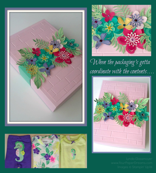
When the packaging’s just gotta coordinate with the contents

Packaging collage

I had occasion recently to wrap a baby gift. Now, this wasn't just some random baby gift, but rather, in celebration of the upcoming arrival of my 2nd granddaughter. So if there's ever a reason to spend a little extra time wrapping something, I figure that that would qualify. I'd picked out this adorable little 3-piece set – 2 onsies and a coordinating pair of pants/leggings. Yes, I know the pant legs will be too long; manufacturers have had DECADES to figure out babies' legs aren't proportioned to the rest of their bodies yet, but for some reason they refuse to adjust accordingly. But I digress. I had this cute little clothing ensemble and it needed to be wrapped. Appropriately.

So the first thing I reached for was cardstock in colors close to those of the clothes. Minus purple, of course; I already knew that wasn't
gonna happen. But I was Botanical-Builder-Box-close-up-800-wmsurprised to see how tough it was to match the other colors, too! Especially a yellow-green. Came up empty-handed there, too. But eventually I ended up pulling out some scraps of retired In Colors: Strawberry Slush, Pistachio Pudding and Coastal Cabana…… and then added Bermuda Bay, Pink Pirouette, Wisteria Wonder and So Saffron to round out my options. 
To determine the size of the box I folded (and refolded) the 3 items until I
could stack them up into a size I could create a box for (using only 8-1/2" x 11" cardstock, 'cuz that's what I had available). Luckily, I determined I could do that with a box 5-1/2" x 7-1/2"….. and 1-1/2" deep. YAY!  So I just trimmed a half-inch off the bottom of a full sheet each of Wisteria Wonder (for the box bottom), and Pink Pirouette for the box top. (Leaving me with 8-1/2" x 10-1/2".) Scored 1-1/2" borders all the way around for the bottom, and just the teeniest smidge narrower for the top.  (This technique leaves the box top just that itsy-bitsy bit larger so it'll fit over the bottom.) 
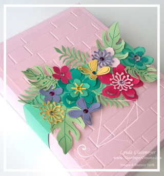
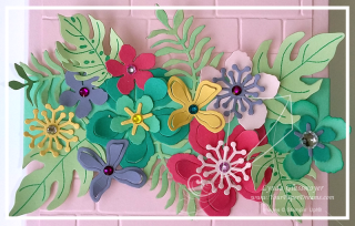
Botanical-Builder-Box-800-wmAfter assembling the box I determined that that much surface looked just a little bit  "flat", so I added a layer using the Brick Wall embossing folder. Figured that made a decent base to work with, and the fun was about to begin.

Now, I have to confess that I love flowers (DUH! Those of you who know me aren't surprised, are ya?), and after 20 years of working with flowers in the paper and ink world I've figured out it's not likely I'll ever tire of them. And whenever I can combine flowers with DIMENSION, so much the better. So it's really no wonder the Botanical Builder Framelits have become my "go to" faves these days. 

So this is the result. I shaped the flower petals and leaves with a bone folder and also wrapped some elements loosely around a white gel pen. (Ugh! Just realize that's been retired. YIKES! How'd I miss that?!?) All the flowers are glued to a belly band that simply slides off to open the box. I love belly bands on boxes for this purpose; you can get as elaborate as you want with the decoration, and yet nothing has to be untied or otherwise destroyed when it's time to access the box's contents.  A perfect packaging solution in my book!

Buy NOW, get a coupon for NEXT month!

Now here's something ELSE really cool! Right now (and through the remainder of July, actually), for every $50 of product you order through me (at one time, that is), you'll get an emailed coupon worth $5 towards product(s) you order NEXT month. (Specifically Aug. 2 – Aug. 31 .) And there are no limits as to how many $5 coupons you can accrue; you'll get one for every $50. So for instance, if you like the Botanical Builder Framelits AND the coordinating Botanical Blooms Stamp Set I've used on this project, well, guess what?! ? Conveniently, they both add up to $50, and BOOM! you've earned a coupon to spend next month! Or choose $150 in product (ordered at one time) and get not only THREE $5 coupons for next month ($15 value, that is), but also $15 in Stampin' Rewards THIS month, too! Get the idea?!?

Here are the products I used on this project; items that are currently available (at time of this writing) will link to my online store:
 

Strawberry Slush 8-1/2" X 11" Card Stock

Strawberry Slush 8-1/2" X 11" Card Stock
[131295]
$6.95
Pistachio Pudding 8-1/2" X 11" Card Stock

Pistachio Pudding 8-1/2" X 11" Card Stock
[131294]
$6.95
Coastal Cabana 8-1/2" X 11" Card Stock

Coastal Cabana 8-1/2" X 11" Card Stock
[131297]
$6.95
White Signo Uni-Ball Gel Pen

White Signo Uni-Ball Gel Pen
[105021]
$4.00


Post Falls High School Craft Fair 2015

I had a ton of fun chatting with so many friendly people at the Post Falls High School Craft Fair on Saturday! And was especially impressed to see how many Stampin' Up! demonstrators dropped by! I think by day's end there had been about 7 or 8 demonstrators who'd popped in and introduced themselves; now, if only I was good with faces and names to remember 'em all for *next* time, lol!

And the morning crowd was amazing; I remember looking up at one point and seeing the (quite wide) aisle completely filled with people in both directions. This was obviously not only a craft fair, but the day's social meeting point as well!  🙂

If you've attended one of my booth events over the years you know that I'm not one to just hang and wait for someone to show up. But rather, I generally keep myself busy stamping some kind of little give-away goodies. This year and last I chose gift tags for that item, and this year I particularly wanted something I could crank out quickly and not have to clean stamps along the way. So what's my favorite "quick stamp" technique?  Something monochromatic! Not only can a single color of ink be a real wow, but it holds down supply costs and there's zero chance of sticking the stamp into the wrong ink pad! (Something that's always embarrassing to do in front of an audience.) I knew my working space would be limited, so the simpler, the better, I figured.

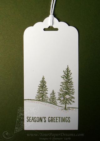
So here's the simple, monochromatic design I made and gave away 60-some Tag_Mossy_Meadow
of in 6 hours.  (Actually, more like 4-1/2 hours, because the last hour and a half of the 6-hour show was basically dead.)

This tag began as a 2" x 4" piece of Whisper White cardstock. I chose Mossy Meadow for the ink color, and then there were just a few simple steps…..

  1. I chomped off one end with the Scalloped Tag Topper punch.
  2. The snowy trees image (from "Happy Scenes" stamp set) was placed about 1/3 of the way up from the bottom. (Remember that when using photopolymer stamps, I always recommend placing a piercing mat underneath to compensate for the lack of foam layer on the stamp itself.)
  3. "Season's Greetings" image (from the same set) was placed in the lower area, closer to the left edge for weight balance.
  4. I applied 2-way glue pen in the areas to be glittered….
  5. Then dunked into Dazzling Diamonds glitter and shook off excess.
  6. Finally, I folded a 12" length of Whisper White Bakers Twine in half, brought the two ends together through the tag hole from back to front and looped through the fold for the tag ties.

IF I'd been able to find a "To / From" stamp I'd have either positioned that in the upper left-hand corner or on the back, but after searching in vain through my entire collection of current stamps I sadly concluded I must have sold or retired any such stamps that I once owned. Shoot. There are 3 such pairs of stamps in the current Holiday Catalog, and at least that many in the Annual Catalog, but doggone if I could find 'em when I was tearing through my stuff searching for 'em, lol! Oh well, we'll just call that "white space" – an important element of design, too.

Product List

AND DON'T MISS THIS WEEK'S "WEEKLY DEALS" – available until discounted supplies are exhausted, or thru Monday, Nov. 16, whichever occurs first:

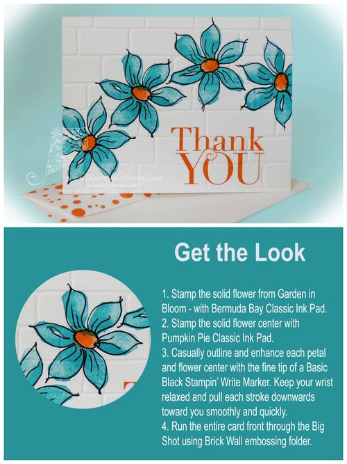
Garden in Bloom meets Fun Frames

Get the Look - Garden in Bloom meets Fun Frame

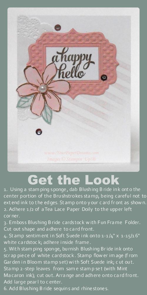
One of today's trendy looks is creating a focal point from a grouping of individual elements. Often, the sentiment is included as one of those grouped elements, and there may also be subtle texture or other visual interest in the background. This card features all of those.

Those who've been following me for a while know that some of my favorite techniques involve applying ink in non-traditional ways. This card features two such examples.

The diagonal lines of the background represent the first such technique. To get that look, I inked a stamping sponge (just by pouncing it on the Blushing Bride pad), and then dabbed it onto the center portion of the Brushstrokes stamp. I was careful to avoid extending the ink as far as any of the edges of the stamp, as that would give a harsh edge when stamped. Rather, what I was looking for here was a softer, more cloudy look, where the inked image just kind of fades in and out. Once the ink was applied, I stamped the background at that jaunty angle for yet more visual interest.

Another favorite way I like to use ink a little "out of the box" is when I want a piece of colored cardstock that's more subtle than the intense colors of our regular cardstocks. In this case I wanted a Blushing Bride flower, but a much softer shade of it than the Fun Frame it would be backed with. So I just burnished Blushing Bride ink onto a scrap piece of Whisper White cardstock with a stamping sponge before stamping the flower image onto it. (My version of "burnish" is to rub ink down into the cardstock in a circular motion. I actually do try to rub the ink right into the cardstock, so I start with a light hand and then get firmer and firmer as I rub in circles. Every time I reload the sponge from the ink pad I am careful to tap my sponge off once or twice onto my scratch paper so I don't accidentally get a "blob" of ink when I first touch the paper I'm working on. You can always add more ink, but can't take it away if you get a "blob", ya know.) So once I decided I had the color intensity I wanted for this, I just stamped the flower image (from Garden in Bloom) right onto my newly-colored paper and then fussy-cut it with Paper Snips.

The leaves are stamped in the more usual 2-step method this stamp set was designed for….. and then also fussy-cut.

When I first introduced this card at card class last month several of the ladies groaned at the assumption they'd have to cut out the center section of the embossed Fun Frame. But no worries there; it's just it's own layer of Whisper White cardstock (1-1/4" x 1-15/16") – stamped and applied on top of the frame! Easy-peasy!

Even though none of these elements is popped up on Stampin' Dimensionals I still wanted to retain a suggestion of depth anyway. So I only applied adhesive to the center areas of the frame, doily and flower, leaving their outer edges free.

Oh! And a tip for applying the sequins: place a tiny dot of Fine-tip Glue where you want the sequin to be, then lay the sequin right over it. Remember – that's a "TINY!" dot, in order to avoid a glue smear!

Don't you think this same general layout would be fun to work up into a Christmas card? I'd love to see your examples if you do that!


Product List

Guest Artist – Watermelon Mini Treat Bag

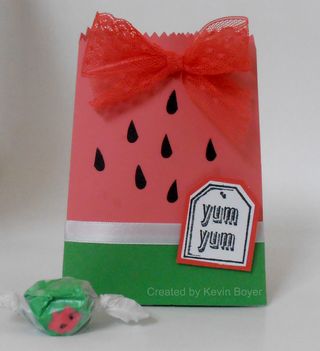
P8060056Kevin Boyer has earned a reputation as an excellent stamping party and class host, and I suspect one of the ways in which she encourages awesome attendance is the darling handmade favors she prepares for everyone! Last month I had the privilege of gathering with Kevin and her friends again for a card-making class while I was visiting back on Whidbey Island.

For that event Kevin had picked a watermelon theme for her favors – using the new In Color "Watermelon Wonder", as well as various watermelon-flavored candies and gum. The main bag is cut with the Mini Treat Bag Thinlits Die, ribbon is 1" Dotted Lace Trim, and the darling seeds are actually punched hearts cut in half! (The heart punch, white ribbon, tag punches and "Yum Yum" stamp are retired, but sure still work well here…. and I think the green and lighter pink are also retired cardstock colors, as well. Guessing at Strawberry Slush and…..??????)

Thanks for yet another awesome party and take-home favor, Kevin!

Product List

Small Heart Punch

Small Heart Punch
[117193]

Garden in Bloom meets Freehand Drawing

Garden in Bloom meets freehand tutorialHere's a fun way to get a big bold look in practically no time at all! I'm loving the new THICK Whisper White cardstock these days – for cards that stand bold and proud on their own, without having to use multiples layers of cardstock to give them some heft. So this one was literally just stamp, outline, and emboss. Done!

Limiting the colors to just 2 keeps the attention focused right where you want it….. on the images and your freehanded line work.

Don't forget to use a Stampin' Pierce mat under your paper when stamping with Photopolymer!

Product List

Monochromatic Welcome Cards

P8060057-web

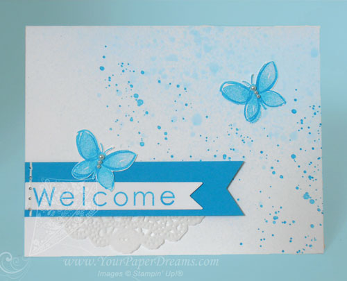
Today I've been working on welcome cards for some new team members. Since Tempting Turquoise is our Paper Dreamers' team color, my welcome cards always feature that color – usually in a monochromatic theme.

For today's cards I started by spritzing a rubbing alcohol & ink-refill combo onto a section of the card…. deliberately leaving the upper left corner white to give the overall look some intentional "white space". That dried pretty quickly, and then I added the more distinct spatters with Gorgeous Grunge. The 2-step butterflies (from Garden in Bloom) were stamped onto another piece of Whisper White cardstock and then fussy-cut to maintain their true white backgrounds. Faux stitching anchors the end of the banners and self-adhesive pearls finish off the butterflies.

Here's how I got the "Welcome" letters aligned.

 Product List

Dad’s Day

So the other day I found myself staring at my never-used, still-shrink-wrapped (although already retired) Adventure Bound Designer Series Paper Stack. Considering it was one of the very first things I'd ordered from the 2015 Occasions Catalog, and I still love its images so much, why in the world had I not even opened it?!?

Well, the answer to that is a bit complicated, but suffice it to say that when my gaze landed on it the other day, I happened to be in the "gotta make a Father's Day card" mode. And I knew this paper would be perfect. So if you promise to keep this just between you and me (and since I'm pretty sure Dad never looks at my blog, lol), I'll share my results. 

P6170241---web---copyright

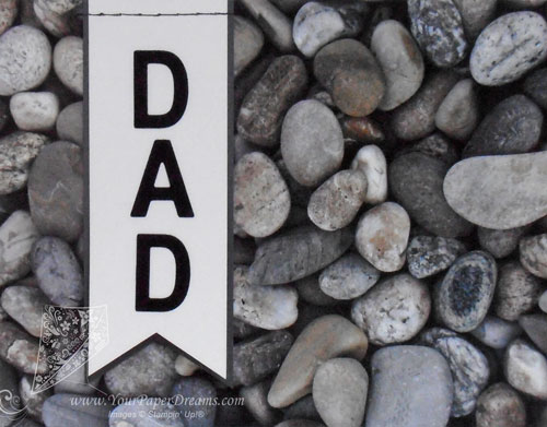
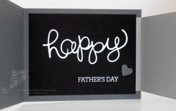
I knew I wanted something a little more creative than just a piece of pretty paper stuck on the front, so I started with one of my "go to" tips for creating "guy" cards: "Stick to neutrals", and then built from there. I already knew I was headed for a tri-fold of some kind. For this color palette: Basic Black, Basic Gray, Smokey Slate and Whisper White. I spelled out "Dad" with one of my most-reached-for die sets – "Little Letters Thinlits".

The double-layer banner is from the brand-new "Triple Banner" punch. BTW, did you know you don't HAVE to stick to only the 3 widths of paper they mention in the catalog for that punch?!? You can probably see that I didn't.

I did some faux stitching across the top of the banner using the piercing tool, Updated Essentials pack & a black marker. (I actually had the Project Life markers at my fingertips, so I used the smaller of the pair, but I'm sure the Basic Black Stampin' Write marker would have worked fine, too.) Used the marker not only on the outside, but the inside, too – so the stitching actually does look reasonably realistic.

P6170244---web---copyright P6170243---web---copyright


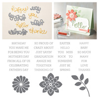
Both the big  "Happy" and "Father's Day" are from the "Crazy About You" bundle. I truly believe that the stamp set "Crazy about You" belongs in every stamper's collection, and you might as well toss in the dies and get a discount, too.  I've certainly ended up using mine more than I thought I would. Tip: Adhere the die-cut word with 2-way glue pen, but work quickly so it doesn't dry on ya.  "Father's Day" is stamped and embossed in Whisper White.

And the little punched heart for subtle embellishment? Our retired "small heart" punch. While I love the newer sweet-heart shape, there are just certain times you need a small basic heart shape. So that's ONE punch that won't be showing up at my Crafter's Garage Sale on Friday!

Cutting dimensions are:

  • Adventure Bound DSP (front): 5-1/2" x 4-1/4"
  • Adventure Bound DSP (inside): 4-1/2" x 3-1/4"
  • Basic Gray card base: 11" x 4-1/4"…. scored & folded at 5-1/2"
  • Smokey Slate right-hand panel: 5-1/2" x 3-1/2"…. scored & folded 3/4" from one end.
  • Basic Black liner: 5" x 3-3/4"
  • Scrap of Whisper White large enough for the die: approx 4-1/2" x 2-1/2"

Now remember, this is still just our private secret until Father's Day, right? Shhhhh…….

Product List

Small Heart Punch

Small Heart Punch
[117193]


Tape It – Better late than never

  Tape It Gift Bag

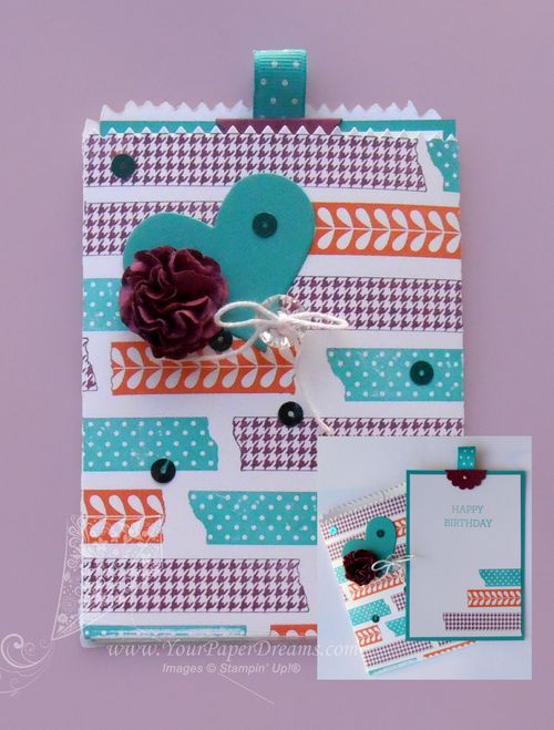
 So wouldn't you know that as soon as I received my long-desired stamp set "Tape It", it landed on the retiring list! Thankfully I was able to squeeze it into one card class, and then that card inspired THIS project. I LOVE this stamp set! It's so versatile, so forgiving and easy to work with, and I only wish I had more time to experiment with other color combos!

For this project, I paired "Tape It" with another product I'm currently passionate about – the "Mini Treat Bag Thinlits Die" (which thankfully ISN'T retiring). Colors are Bermuda Bay, Tangerine Tango and Rich Razzleberry…. all from the Brights Color Collection.

For the basic construction I cut both pieces of the bag and attached them together to make one flat surface….. and then stamped onto that in a random color pattern before assembling the rest of the way. I decided not to obsess over the fact that the images don't line up at the seam in the back (although I suppose I COULD have fussed with my grid paper and Stamp-a-ma-jig has I wanted to obsess), and I particularly love that this design is forgiving when the individual stamped images aren't even straight! The card inside measures 3-1/2" x 5".  (Oh, and the little loop of Bermuda Bay ribbon on top is retired, but of course you could use any ribbon you've got handy.)

Finally, I dressed it up with a paper flower, a heart cut from the same die set, a vintage button and some fun matching sequins.

And perhaps the coolest thing about this type of card/bag combo? Without quite as many lumpy-lumps as this one has, it would fit into a regular envelope for mailing…. even without any extra postage!

Product List

A big ol’ pile of notecards

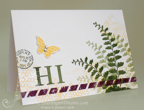
Just finished making a big pile of these notecards, and I simply can't get enough of this Butterfly Basics! I am going to be SOOOOO sad if that stamp set doesn't make it into the upcoming catalog! Thankfully, we demonstrators will get to see the new catalog early tomorrow morning, so I don't have too many more hours to speculate and worry, lol.

Butterfly-Basics-notecard----web

As I was selecting colors for this design I knew I would use a green, of course, and I wanted 2 other bright colors as well. So I started by pulling out Mossy Meadow for my green, and then grabbed that super-yummy Blackberry Bliss as long as I was in the 2014-2016 In Colors section anyway. Daffodil Delight, which was already on my work table, seemed handy for the remaining 3rd color.

When I work with 3 different colors I usually think in terms of "large", "medium" and "small" volumes of the colors. So I decided for this card my "large" volume would be  Mossy Meadow, "medium" would be Daffodil Delight, and the splash of "small" would be done in Blackberry Bliss.

I started by playing around a bit with 1st, 2nd, 3rd and 4th generation stamping for the fern images….. working to get the angles (and rhythm) arranged in a way that would be quick and effective for the couple dozen I was just about to crank out. So that part went down first – on the entire pile of notecards. (Actually, when I'm cranking out a big bunch of cards just alike, I prefer to work assembly-line style, doing the same step on each card. That gets me in a rhythm and eliminates putting tools down and picking them back up again. Because every time you open or close an ink pad, or pick up or put down a stamp, time is ticking by.)

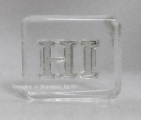
P4290196---webNext came that whimsical and unexpected stripe of Blackberry Bliss parallel to the bottom edge, and then a grouping of 3 images to help balance the weight of the dark ferns. The first part of that grouping, the word "HI", is from Sophisticated Serifs, another Occasions Catalog stamp set I surely hope also transitions into the upcoming catalog because I've found a lot of uses for THAT, too!

To get the letters even with one other I started by laying them down on the grid surface of my paper trimmer, the same way I demonstrated here. Once they seemed properly aligned, I just set my acrylic block straight down on top of them (with its lower edge also aligned with the grid) to pick them up as a unit. Of course I tested them on my grid paper before proceeding, and ended up adjusting the "I" slightly before calling it perfect. But from there on I was able to stamp the two letters together as one image. For placement, I just eye-balled it and aimed for about 1/3 of the way up, and 1/3 of the way in from the left. (Rule of thirds.) Figured that was generally close enough to be acceptable.

The remaining two images of the grouping of 3 also came from Butterfly Basics, with the butterfly being stamped onto scrap Whisper White cardstock and punched out with the Bitty Butterfly punch. A few random thumps of Daffodil Delight applied with that fascinating background stamp from the same set pulled the images together, and a couple of rhinestones on the butterfly finished it all off.

NOW to get these addressed and into the mail!

Product List