Coastal Weave Embossing Folder Meets Peaceful Poppies

Coastal Weave Embossing Folder Meets Peaceful Poppies

What a Month!

Wow! The last day of May already. Hard to wrap my head around all that’s happened this month (both good and bad), but I’ve been mighty grateful to have had access to the internet and various online services so I can continue to be active with and enjoy my Stampin’ Up!® business!

This month I upgraded my video lighting for a “bit” better look for my online presentations. But I think I may have had a little higher expectation from my new lights than they’ve delivered; somehow new lighting hasn’t entirely eliminated the fact that I’ve been a demonstrator with this company for 24 years, and well, I look at least that many years older in front of the camera. That I have a growing number of wrinkles and sags in places I’d rather not have. That my “quarantine hair” is much too long and much too gray. And that my tiny poorly-lit apartment is…. well, a tiny poorly-lit apartment.

But nonetheless, I’ve had a lot of fun this month connecting with my stampin’ friends while presenting 3 online events… beginning with my 3rd monthly template-based card class via Zoom, and then followed by 2 more events which were live-streamed to my Facebook page. None of these were flawless, but I’m learning to cope with the unexpected and “oops-es”… and not die of embarrassment. (Can we say “open mic” during yesterday’s intermission?!? Now the world knows I talk to myself when designing, lol.) So I choose to chalk up the flub-ups to “learning”.  And I truly appreciate all in the Paper Dreamers community who seem willing to accept the imperfections as I learn all this new tech stuff… and participate in these online activities anyway! Thank you from the bottom of my heart!

Mystery Card Class - Episode 1

Coastal Weave Embossing Folder Meets Peaceful Poppies

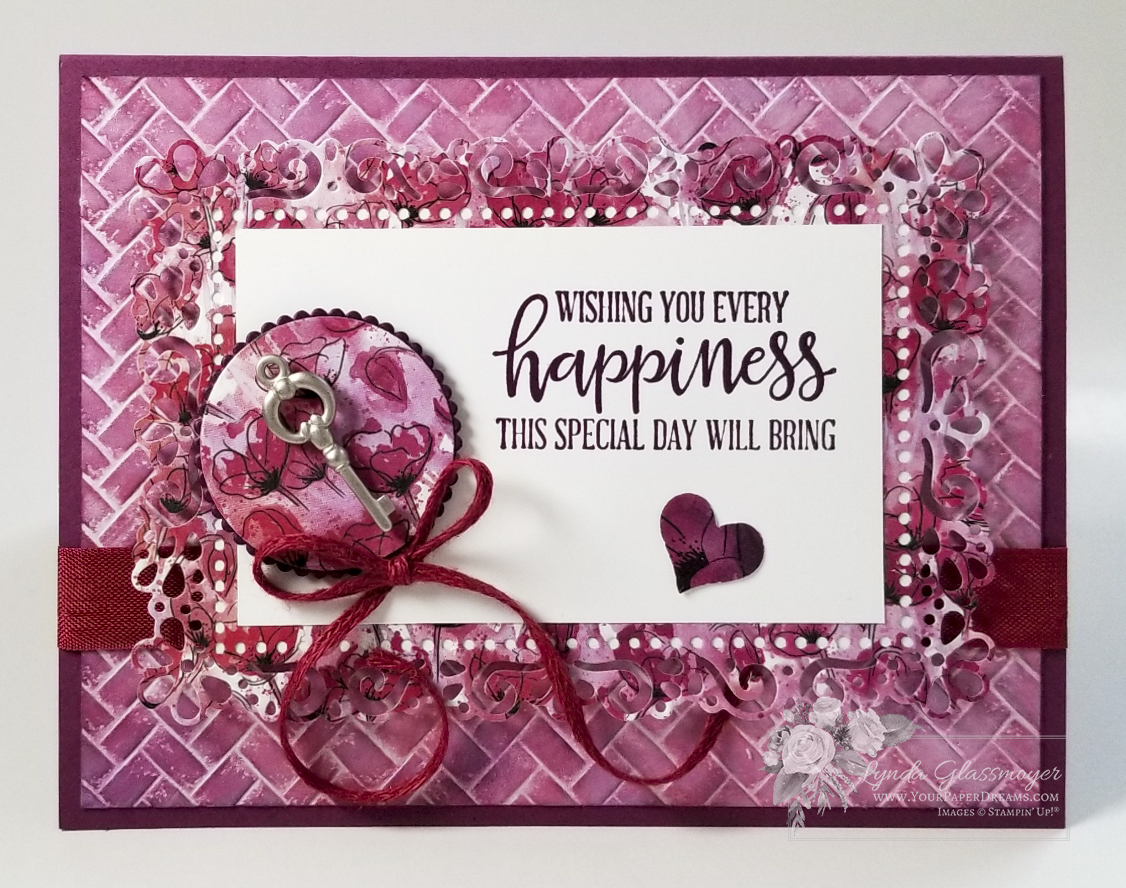
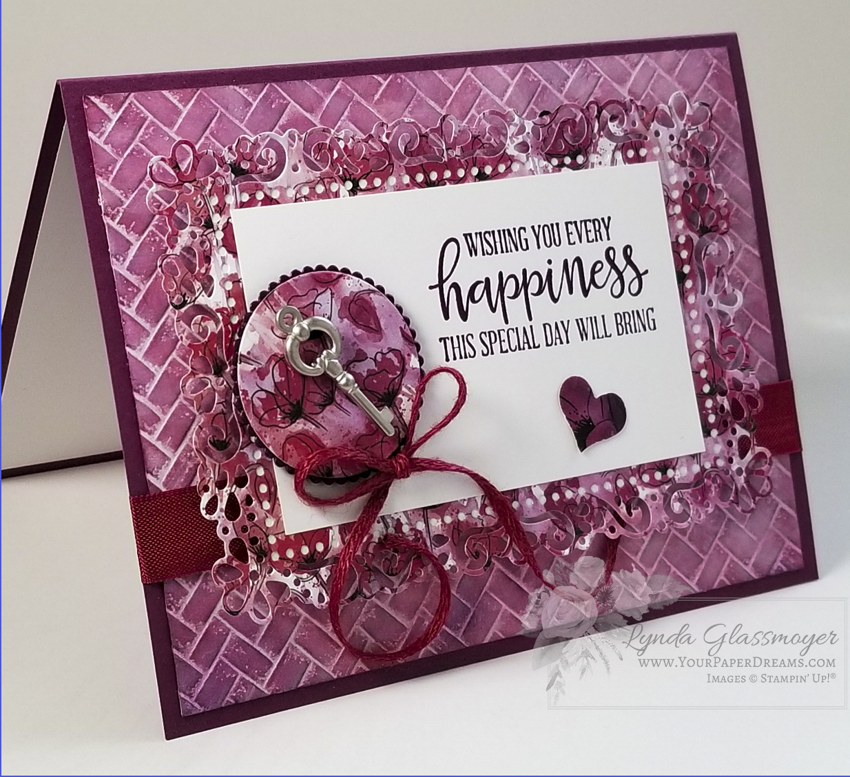
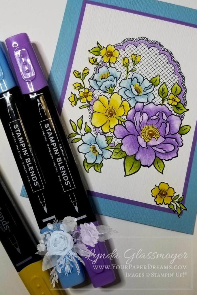
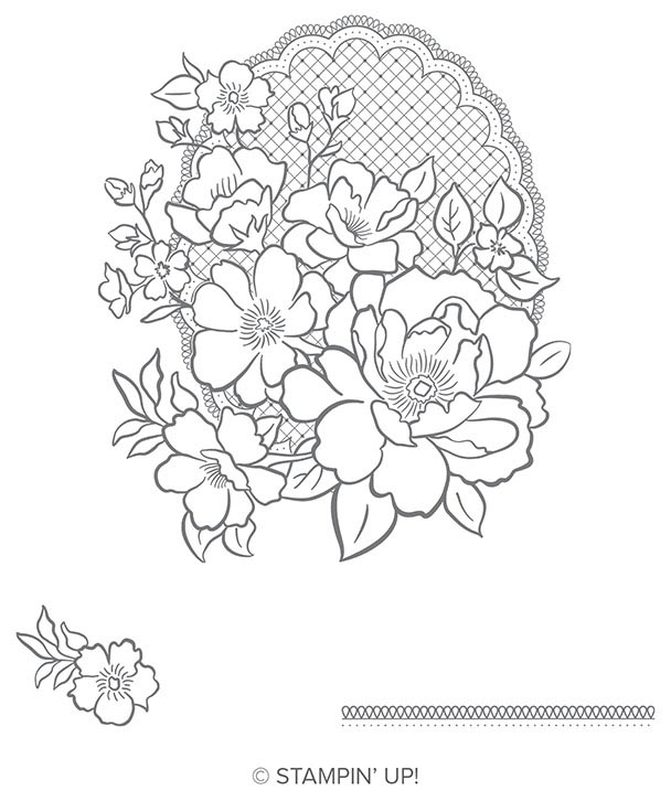
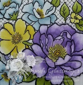
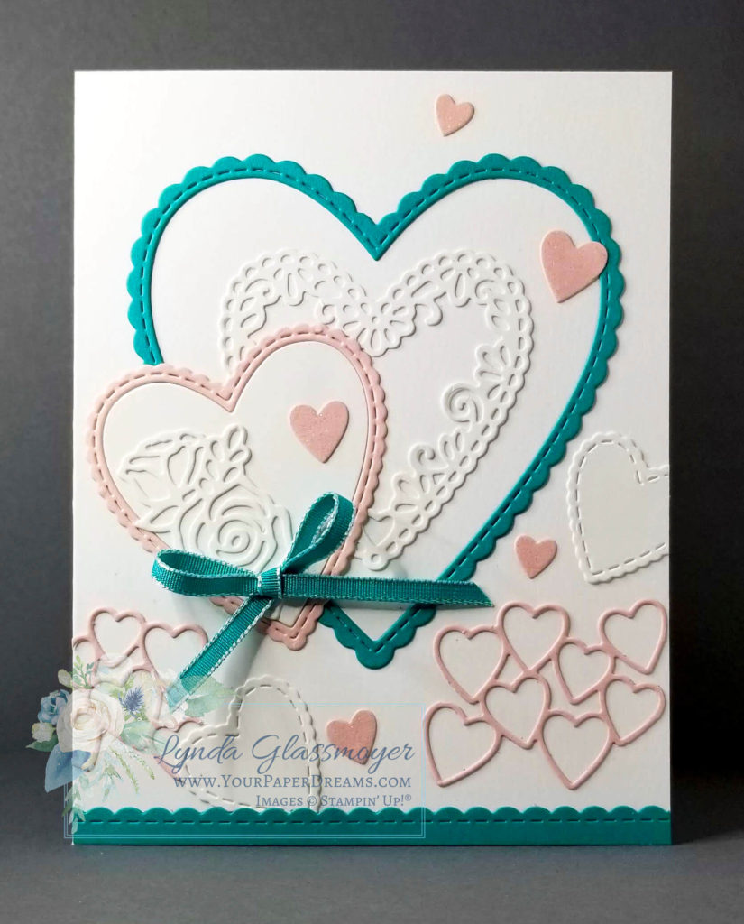
This was the 3rd card I created during yesterday’s inaugural presentation of “Mystery Card Class”, which was live-streamed to Facebook. The concept for this class is to follow along with some specific guidelines for making a card of your choice, while trying to resolve the “mystery” that looms in the background. And the clues to the mystery will eventually appear in the cards that participants stamp and post online for the viewers to see. 

I’d sent out prepared card kits to several stampers in advance, and invited them to participate in this event by assembling their cards and sharing them with the other class participants. But unfortunately, that plan kinda fell on its face because only 1 card got made up and shared. So we’ve had a significant shortage of “clues” (as compared to what I’d envisioned), and therefore yesterday’s mystery stands a good chance of remaining unresolved, and the intended prize not awarded. 

Ah! But I don’t give up that easily. I’m up for trying again next month, and hopeful that we might get broader participation. And if you receive one of the card kits I send out for Episode 2, please do play along by making up your card and showing us the result. The more participation this event can get, the more fun it will be!

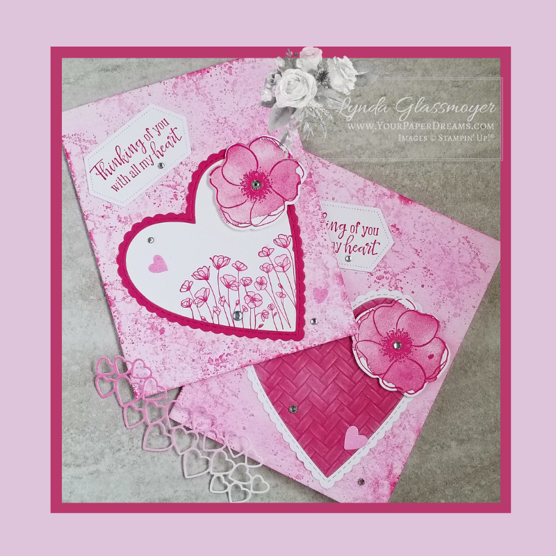
I can't believe Coastal Weave Embossing Folder is retiring already!

This particular embossing folder has become my very favorite during its short life, and I’m really going to miss it. So when it came time for designing cards for yesterday’s class, I *had* to give it yet another workout before bidding it farewell.

So I ended up using not only my current favorite embossing folder, but also one of my very favorite techniques… applying and blending inks with various types of applicators. For this background, I began with a piece of regular Whisper White cardstock and embossed it with the soon-to-be-retired Coastal Weave 3D embossing folder.

Then I went after it with several ink colors, applied with Sponge Daubers… gradually building up light layers of Rich Razzleberry, Poppy Parade, and Blackberry Bliss classic inks until I had the look I wanted. I deliberately tried to vary the intensities of each color in different areas so the color wasn’t entirely even throughout.  I’m always thrilled to watch what develops when applying layers of color this way, and given that I was working with some of my favorite colors, I got more and more excited as the overall look developed! 

Once I had the general look I wanted, I went back over it with the Frost White Glimmer Paint (also applied with a sponge dauber) to give it a sheen. (Which may or may not show up in the pictures.) 

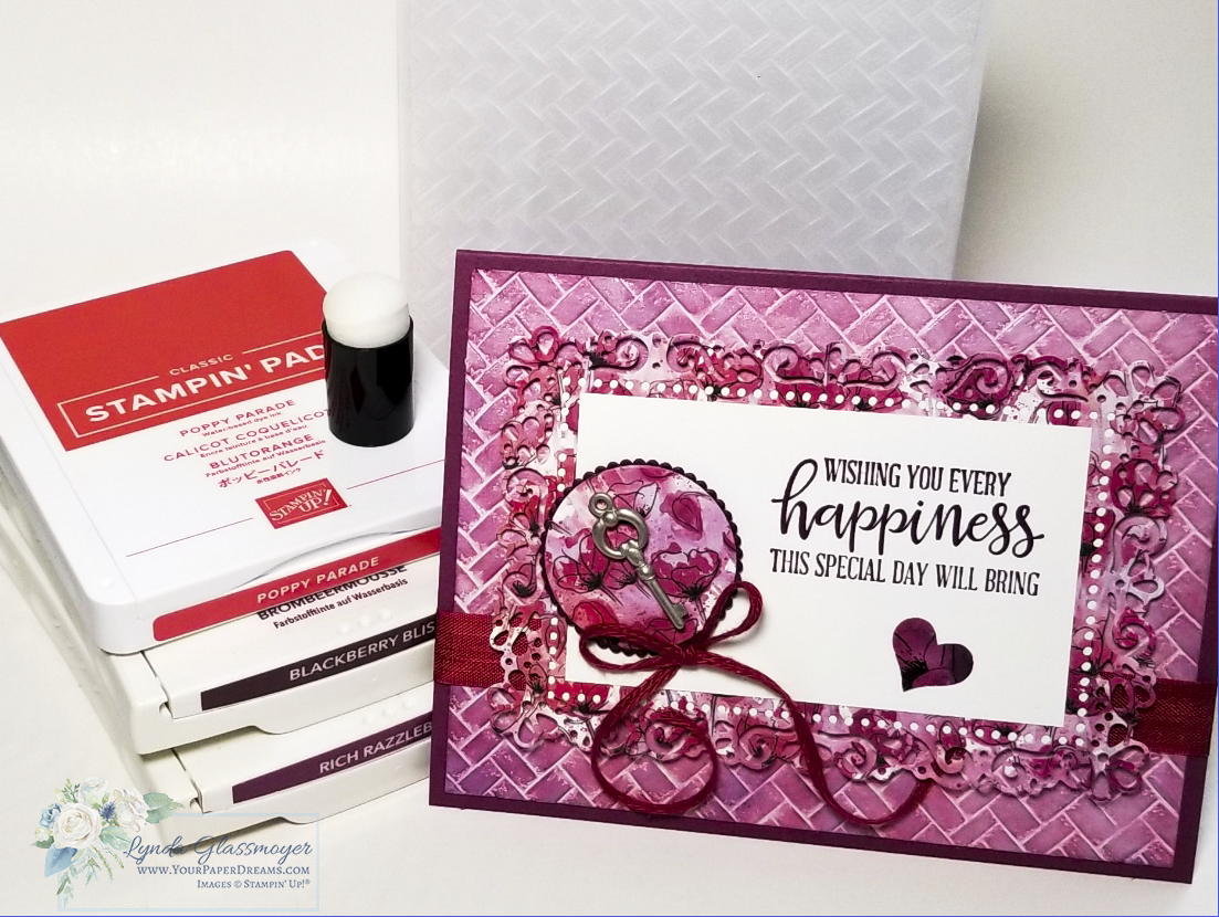
Additional supplies I used include Rich Razzleberry, Blackberry Bliss, and Whisper White cardstock, several sets of dies, various elements from the Peaceful Poppies Suite, and some retired trim & accessories I found while digging through my stash.

If you still need to add the Coastal Weave 3D Embossing Folder to your own collection, it’s still available in my online store, and as long as supplies hold out, will be for 2 more days… thru June 2nd. Grab yours here.

And be sure to bookmark my calendar page so you won’t miss what’s coming up!


“Painted Poppies” Valentine Cards

“Painted Poppies” Valentine Cards
Valentines wtih Painted Poppies
"Painted Poppies" Valentine Cards

Today I’ve got some serious monochromatic pink for you, in the form of “Painted Poppies” Valentine Cards. ‘Cuz what says “Happy Valentine’s Day” better than hearts and flowers, right?

Both of these cards feature Melon Mambo and Whisper White, along with some of what I consider the most basic dies that we should probably all have in our collections. And, of course, my current favorite stamp set, “Painted Poppies”. 

die-cutting-basics
Are you missing any of these basics? Sale-a-Bration is a smart time to update your collection of dies because you get to choose free product(s) with every $50 you order!

Can you find all the places I've used "Painted Poppies"?

20200214_111014 wo wm
Images © Stampin' Up!®
20200214_110923 wo wm
Images © Stampin' Up!®

And this card is basically the same, except the Whisper White and Melon Mambo of the large heart are reversed, and the inner heart is then stamped with an additional image from the “Painted Poppies” stamp set. 

Want more details about these cards? Be sure to order your Painted Poppies stamp set (or bundle) by Saturday, Feb. 15 (that’s tomorrow, btw), in order to receive the package of tutorials I’ll be sending out after that! Contact me to place your order for you, or submit it yourself at store.YourPaperDreams.com. (Current host code is always at hostcode.YourPaperDreams.com)

Birthday Card for Three

Birthday Card for Three

So have you ever had to come up with a birthday card for three siblings (1 boy + 2 girls) celebrating their birthdays at the same party, yet their ages range from 9…  down to not-quite-3?

Actually, these kids’ birthdays are scattered all throughout the calendar year, but not particularly at convenient “birthday party” times. So last weekend they were all honored at a joint fete at the local splash park – so they and their friends could usher in the beginning of summer.

The “Birthday Card for Three” Dilemma…

So exactly what’s a card-maker to do for such an event? Gifts were discouraged, yet there would be an opportunity to donate some spending cash to a fund for an upcoming family theme park trip. But certainly, a handmade card was in order for an event as unique as this.

So I searched through my stamp collection, hoping for inspiration.

I contemplated basketball, princesses, and mermaids. I’m sure if I could draw I could have come up with something that incorporated all 3 of their signature themes, but the reason I’m a rubber stamper is precisely BECAUSE I cannot draw! And sure, I realized I could make each kid a separate customized card, but hey, they get their own separate cards for their “real” birthdays anyway. But THIS event was unique…. more like an “all-of-us” kinda party.

Inspiration finally strikes

Ultimately I ended up turning to words and phrases to convey my message. Enter the stamp set “Itty Bitty Birthdays”, paired with some of Stampin’ Up!’s newer colors Poppy ParadeCall Me Clover, and Mango Melody, along with a good ol’ standby birthday balloon from the retired stamp set “Balloon Adventures”.

Itty Bitty Birthdays

Itty Bitty Birthdays Cling Stamp Set

Itty Bitty Birthdays Cling Stamp Set
[148618]
$23.00

If you’ve stamped with me for very long you’ve surely heard my philosophy of “You can’t ever have too many flowers, words, or alphabets in your stamp collection”. And once again, this philosophy ultimately resolved my dilemma. What really surprised me, however, was that I found all the sentiments I needed right there in a single stamp set: “Itty Bitty Birthdays”! I’d surely expected I would need to mix and match words from several stamp sets – but that wasn’t even necessary! For a stamp set that’s only been around for a few months, I’ve found myself reaching for it over and over again. I guess that confirms it was a valuable investment!

You can’t ever have too many flowers, words, or alphabets in your stamp collection.

Here's the card I eventually designed.
Here’s the card I eventually came up with. I was really surprised (and pleased) with how well it coordinated with the cake – that I hadn’t even seen yet!

So next time you need to make a birthday card for three (or some other unusual, out-of-the-mainstream theme) and you’re stumped for inspiration, consider using words as main images!

Lovely Lattice Stamp Set meets Stampin’ Blends

Lovely Lattice Stamp Set meets Stampin’ Blends

One of my favorite “Freebie” choices from the 2019 Sale-a-Bration (going on now through March 31) is the stamp set “Lovely Lattice”. And when it’s brought to life through the magic of Stampin’ Blends, well… now there’s a match totally made in heaven!

Lovely Lattice – Choose this stamp set for FREE with a $50 product order during Sale-a-Bration 2019. (Thru March 31, while supplies last.)

I was almost sad to see this card completed. Coloring in an outline image isn’t all that far off from the days of crayons and coloring book pages – elements of a relaxing past-time I have never really outgrown. So when my eye warned “That’s enough, Lynda; it’s done”, my heart wasn’t quite ready to cooperate. Nevertheless, I reluctantly put down my grown-up crayons and tended to final assembly.

“You can never have too many flower sets (in your stamp collection).”

– Lynda Glassmoyer

Those who know me, know I’m a sucker for flowers. And it certainly shows in my stamp collection! But why not? Flower images are appropriate for (almost) any card-giving occasion, and in this case, I didn’t even have a concrete idea yet for where this card was headed. I had no one specific in mind to receive it, and figured I’d just leave the outside free of any particular sentiment that could limit its use later on.

Getting the look

I began this card by stamping the largest image in the stamp set with Memento Tuxedo Black ink – onto Whisper White cardstock. And then used Stampin’ Blends in both light and dark shades of the following colors to bring it to life:

And a little touch of Pumpkin Pie in some of the flower centers. Then I created the highlights with the Stampin’ Blends Color Lifter.

Lovely Lattice colored with Stampin’ Blends

At this point, I realized a touch of dimension seemed in order. So I took that entire stamped & colored layer and ran it through the Big Shot inside the “Subtle” embossing folder. (BTW, that folder is right up there near the very top of my faves at the moment!)

3D Dynamic Textured Impressions Embossing Folder – “Subtle”

Then I added the same embossing to the front half of the Balmy Blue card base. I mounted the stamped & embossed layer onto an un-embossed layer of Highland Heather, and then adhered those layers onto the card base. The textural difference between embossed layers and those without embossing seemed to strike just the right contrast.

The final details

But it still needed just a bit more dimension. So, grabbing one of the Pumpkin Pie Stampin’ Blends, I quickly transformed a few “plain-ol‘-white” pearls into coordinating flower centers and added those to some of the flowers.

And that little flower down in the lower right corner? It was stamped onto a scrap of Whisper White cardstock, colored in with the same Blends markers, and then fussy-cut and positioned for visual balance.

Did you know that if you were to order all the Stampin’ Blends I’ve use here, and toss in the “Subtle” embossing folder, you’d qualify to get this lovely stamp set for free? Get all the goodies here.

Featured products

Handmade Valentine Card – then & now

Handmade Valentine Card – then & now

Remember the days of childhood when it was so much fun to make a handmade Valentine card? You’d drag out the construction paper, scissors, and paste, and create something really special straight from your heart, right? Well, that’s exactly what we were recalling as we assembled this card at last month’s card classes!


Handmade Valentine Card – Grown-up Version

For all the color, texture and layers going on with this card, it’s deceptively simple to make… although not necessarily quick to assemble. Actually, it might be the type of card you’d choose to put together while watching TV, so your mind could focus on something other than gluing hearts down in place. Again and again.

The colors featured on this card are Blushing Bride and Bermuda Bay – which together, make up one of my favorite color combos.

Oh! Wait! Um, let me try that again…

ANY color that coordinates and combines with Bermuda Bay represents “one of my favorite color combos“, lol! But yep, this is indeed one of my regular “go-to” combos.

And can you believe that everything, with the exception of the ribbon, was created with just one die set: the “Be Mine Stitched Framelits Dies“?!?

Be Mine Stitched Framelits Dies

So it’s all pretty simple, actually.

It starts with die-cutting all the pieces and then laying them out to dry-fit. (The two Blushing Bride lengths of hearts near the bottom are actually one piece put thru the Big Shot and then carefully trimmed into 2 sections with Paper Snips.) Once you’ve got that done and everything’s laid out to your satisfaction, it’s time to anchor everything down. My adhesive preference for this step is Multi-purpose Liquid Glue, applied in tiny amounts at a time, to the back of each die-cut element using a small piece of scrap-paper as an applicator.

“When it comes to applying glue, less is more.”


Reminder words repeated ad nauseam at most of my card classes.

But basically, that means that less glue not only dries faster, it also leaves fewer smears on your project, fewer sticky fingers, and overall less mess and frustration. And then a happier papercrafter.

Finally, you may want to add some Wink of Stella shimmer to the small solid hearts. It’s my philosophy that you can never have too much shimmer and shine.

Do you have a memory of making Valentine cards as a kid? If so, please share your recollections in the comments.

Sale-a-Bration (SAB) – Perk #1 – Customers get FREE product!

Can you name all 3 (4, actually) ways that a papercrafter can benefit from the perks of Stampin’ Up!®’s annual Sale-a-Bration (SAB) season?

2019-SAB-Botanical-Butterfly-DSP-800

If you’ve been around the Stampin’ Up! community for very long, I’ll bet you can name at least ONE of the perks. But be sure to follow this week’s series of 3 posts, so you don’t accidentally miss out on the *other* 2 (3, actually) available perks, too!

Let’s begin by reviewing a bit of SAB history (that is, as far as my memory recalls…), and then we’ll touch on what (I think) is probably the most well-known feature of Sale-a-Bration. 

I wish I could tell you exactly when this fun tradition began in Stampin’ Up!, but I don’t exactly know. What I DO know is that “Sell-a-Bration” was already going on back 23 years ago (in January of 1996), when I first became acquainted with the company. But although it was an exciting time of year way back then, the format wasn’t even close to the generous SAB season we are familiar with nowadays. The way I remember it as a brand-new customer, is (I think) we could choose a stamp from a unique collection (note: a small, single wood-mount stamp) – for a dollar. I remember being really excited about getting that additional bonus with my order, and I chose a teddy bear. (I even got to take that stamp home with me that night!) And I know I’ve come across that stamp from time to time throughout the years, so it MIGHT still be in my collection of stamps that are deeply buried in storage somewhere.

Through the years, the name “Sell”-a-Bration morphed into “Sale”-a-Bration, and the perks evolved, too. In general, they’ve become more generous over time (especially compared to that year when you could buy a small stamp for only $1!), but it’s always been the biggest season of the Stampin’ Up! year, and a whole lotta fun!

SALE-A-BRATION PERK #1:

So for *my* stampin’ peeps over the years, certainly the most popular attraction has been getting their choice of free product (usually) created for, and available exclusively during, that season.  For a long, long time now, there has been the opportunity to choose one such special item with each $50 product order placed. And for the past few years, there have also been some bigger choices included, too – for product orders reaching $100 or more. (Examples this year include the “Tea Time Framelits Dies“, which coordinate with the gorgeous stamp set “Tea Together“, shown on page 49 of the Occasions Catalog. And don’t overlook the Distinktive stamp set called “Lasting Lily“, if you’ve had some experience with the line of Distinktive stamps. Btw, in case you might be admiring the “Tea Time Framelits Dies”, but also have other  SAB freebie items on your wishlist, we’ve been notified that that set of dies will carry over beyond the Sale-a-Bration season – but of course it’ll have a price tag attached to it once it does, lol.)

Anyway, certainly my stampin’ friends have found Sale-a-Bration to be a great time to make some of their major investments in tools or pricer products, OR to replenish basic supplies that may have been starting to run a little thin during the past year.

But here’s yet another tip you’ll want to take into consideration when planning your Sale-a-Bration order(s):

Sale-a-Bration items are available on a “while supplies last” basis. (Yeah, yeah, yeah, you’ve heard me preach this before, haven’t you?) But it’s true, and in recent years, the deeper we get into the SAB season (which ends on March 31, btw), the smaller the inventory of choices has become. So I doubt that the full inventory of choices will be available to those who wait until later in the season to submit orders. So my advice will always be to place your orders early in the season, especially until you’ve earned all your most favorite freebie choices. 

Whew! But all that said, did you also notice this statement that appears on the inside cover of the Sale-a-Bration brochure? “Watch for another set of exclusive FREE items coming February 15!”

So take another look through your Annual and Occasions catalogs, along with the SAB brochure, and see what’s fresh and new that you’d love to work with this Spring!

Snowflake Showcase – Last call

November's exclusive "Snowflake Showcase" has certainly been an amazing collection, hasn't it? So many beautiful snowflakes and versatile images – in both stamp sets and dies; I'm super-sad to see it coming to an end. But yep, today's its last day of availability; the curtain falls in just a few more hours.

In the meantime however, I thought I'd share some of the thank you cards I've been sending out recently. Featuring… well, what else, lol?!? Not only some of my favorite winter-time images, but some of my very favorite winter colors, too!

20181125_113855

Besides the "Snow is Glistening"  and "Kindness & Compassion" stamp sets, these cards feature "Layering Ovals" dies; Highland Heather, Gorgeous Grape and Coastal Cabana inks; Frost White Shimmer Paint; Clear Rhinestone Jewels; and Highland Heather, Gorgeous Grape, and Whisper White cardstocks (WW in both regular and thick). And of course, the Stamparatus helped place that "Thank you" image exactly where I wanted it… nice and bright!

20181125_113125

There are still a few remaining hours to claim all or part of this collection for yourself. If you're still debating, let me help. The answer is "Yes!" – because snowflakes of this classic art style will never look dated, they can be used solo or in conjunction with other images on almost any winter project, and look fabulous in pretty much any color. (Well, maybe not so much Real Red or Cajun Craze, come to think of it….. but YOU know what I mean, lol!) 

See what's still available from the Snowflake Showcase here!

Updating Stampin’ Up!’s color line

2
Well, they did it. Stampin' Up! caught me a little off guard this spring by updating their color line while my focus was on other significant things going on in my life. So I'm a little bit late to the table with this "news", but here's a quick run-down of what's up.

Every so often Stampin' Up! refreshes our color line. This is a really good thing as it keeps us on-trend and doesn't allow our color offerings to stagnate. But while my time and attention have been largely focused on other elements of life recently, I guess I hadn't really paid attention to how long it had been since we'd had a significant color update. And apparently, it was time, lol.

3

So on June 1st, with the debut of the upcoming 2018 – 2019 Annual Catalog, we'll have a shiny, new collection of colors to work with!

4
4

Here are some of the highlights of this update:

  • The In Color program will remain the same as it's been; every year 5 new colors will be introduced in the Annual Catalog, remain available for 2 years, and then retire. Given that each In Color collection has a life-span of 2 years, there will always be 10 In Colors in effect at any given time: the 5 just beginning their 2-year term, and the 5 on the 2nd year of their 2-year term. This year's new In Colors are bright and remind me of primary colors, which will be awesome for kid-themed projects and/or graduation stamping because many schools use one or more of these as their school colors!
  • 13 Core colors are retiring at the end of May (unless they sell out first, of course). (That's about 1/3 of our previous core collection.)
  • 27 Core colors (about 2/3 of our previous collection) will remain active, but individual colors may shift from one color family to another.
  • 10 Brand-new colors will join our core collections.
  • 6 Popular In Colors from previous years will return and take their places as new core colors. (Note that Flirty Flamingo is one of those colors, even though previously scheduled to retire this year as a current In Color.)
  • 3 "Basic" colors (Whisper White, Very Vanilla and Basic Black) have staged an uprising and formed their own mini color collection (called "Basics"), which leaves space for 3 MORE colors in our regular line than we've had previously! 

5

6

You may have heard that at the same time as these colors become effective, the ink pad cases themselves will be redesigned as well. That's true, and I'll share more information about that later. But for now, here's Stampin' Up!'s color line-up as it will stand on June 1st. If you'd like to download and study a PDF with this information you may get it here. (For best color reproduction when printing you may wish to print onto photo paper using your printer's "best" setting.)

Happy Halloween!

20171031_133718[1]
Today I'm excited to share the artwork of a sweet stampin' friend, Jane Downs. She showed up to card class last week with a basket of The. Most. Adorable little Halloween treats…. same size as this one, but each a different color and character…. totally appropriate for the trick or treating occasion!  She offered each of us the opportunity to pick one, and although the choice was really hard (they were ALL just so stinkin' cute!), I finally selected Garfield. Jane's little boxes were filled with candy (of course), and although not made with Stampin' Up!'s retired "Curvy Box" die, they were the same shape and style of the die, just a little bit larger. (Apparently she's got some fancy crafting gadget that makes that kind of thing easy.) At any rate, we were all charmed – both by the delightful designs, as well as her thoughtfulness! Thanks for such a sweet surprise, Jane!

Seasonal Chums - Pumpkin
Next, I just had to stick this in here before the holiday got away and it would be too late to show it off. This was my very first attempt at using our brand-new, "available TOMORROW" Stampin' Blends alcohol markers earlier this month, and this happy pumpkin just makes me grin every time I look at him! He's part of the "Seasonal Chums" bundle, which includes the Jack-o-lantern, a snowman and an adorable little reindeer. These charming little characters have both their front and back images on each stamp, and then the corresponding dies cut the entire piece out at once, so all you have to do then is fold it in the middle for a clever little tag. (Hey, the die even punches the hole thru which you can string your twine!) So for this one, I stamped the image in Tuxedo Black Memento ink, and then used Daffodil Delight, Pumpkin Pie and Old Olive Stampin' Blends to color it in. Each color comes in both light and dark markers so they'll blend beautifully.  

Now, one of the features of alcohol markers is that they bleed through your paper, so I did have to cut a 2nd piece of white cardstock with the same die and use it as a liner so the inside of the tag is clean and white…… but that was no big deal. 

Can't wait to share some of the other fun I've been having with my new markers, and I'm sure you're gonna want your own set soon, too!


My new favorite stamp set – Painted Harvest

Well, "Painted Harvest", from the 2017 Holiday Catalog might not only be MY new favorite stamp set, but it seems to have a pretty good track record among stamping enthusiasts in general, so far! Watch for some more ideas and tips for the "Painted Harvest" bundle as September's "Bundle of the Month".

First up, this card, which I made about a dozen of:

Painted Harvest w wm

One of the things I particularly love about the Painted Harvest stamp set is that the 2-step images aren't designed to fit perfectly, so you don't have to stress about perfect alignment. As long as you get them "close", it'll all look fine when finished. That said, I do look to match up the centers of the flower elements as a guide. The centers aren't exactly round, but more oval (kind of), and I have found that if I key in on that unique shape and align that general shape from stamp to stamp, it all works ok.

This card  features the flowers, fern-like leaves, acorn and speckles from the "Painted Harvest" stamp set, the tag die from the "Wood Crate Framelits" set, sentiment from "Teeny Tiny Wishes" stamp set, and linen thread and stamping sponges.  (The ribbon and doily are now retired.)

Painted Harvest w wm close-up

Main colors (other than Whisper White, of course) include:

TAMS Color Builder

Stamping tips: 

Interestingly, there is not one single, fail-safe "success rule" that applies to all 2-step stamp sets. While I usually put down the lightest color first (which usually uses the stamp with the least detail), and follow that with progressively more detailed images (and usually darker ink), every once in a while I'll come across a stamp set that seems to demand a break from that general pattern. The fern images on this set turned out to be one such instance. I found that when I was attempting to align the Garden Green detail stamp atop a Pear Pizzaz base,  for some reason or other I couldn't get the images aligned to save my life. So I simply switched the stamping order, laying down the darker detail image first, and then it was a breeze putting the lighter shade over that. Go figure why that made *such* a difference in success to me, but it did!

And I stamped both elements of the acorn with the same color (Soft Suede), but the lower section was stamped off once, while the cap was stamped with full-strength ink.

144783GWhile this card didn't use it, there is also an adorable coordinating Leaf Punch, which you can bundle with this stamp set to save 10% on both!

146021G


 Check back in a few days for more Painted Harvest ideas.


Click to shop: 

Leaf Punch

$16.00