Paper Pumpkin Mash-up

YourPaperDreams_Paper_Pumpkin_June_2017[a]
There are lots of reasons crafters enjoy Stampin' Up!'s Paper Pumpkin program: it delivers a crafting surprise to your mailbox every month, introduces products that sometimes go on to show up in the regular line later, offers color combinations you might never have tried, and so many more. Personally, I particularly appreciate getting a new stamp set every month that often compliments others I already own. And these projects are perfect examples of that.

Both the gift bag and the "Hooray" card came from this month's Paper Pumpkin kit. I was immediately captivated by the bright, fun colors in this kit, and sat down to assemble every element immediately. (June's kit included enough supplies for 4 gift bags, tags & tissues + 6 coordinating cards with envelopes….. and as usual, sufficient extra elements to use on future projects, too.)

I knew right away who would be the first recipient of one of my bag/card combos, but the occasion called for a little bit different sentiment on the tag than those that came with the kit. So a quick exploration of my stamp sets turned up "So excited to see you!" – from "Marquee Messages". 

Visit http://paperpumpkin.yourpaperdreams.com/ and click on "How it works" to learn more about Paper Pumpkin. And if you decide you'd like to try a subscription (either month-to-month or prepaid), please select my name – Lynda Glassmoyer (Post Falls, ID) – if the system asks for the name of a Stampin' Up! demonstrator. (Thank you kindly for choosing me.)

I can't say as I've ever really been captivated by the color Emerald Envy; it reminds me of Glorious Green, from oh, SO many years ago….. which only saw daylight at my place around Christmastime. But when this kit paired Emerald Envy with Melon Mambo for this charming watermelon, well, ok, I had to admit I liked it. In fact I liked it so well I had to keep using it, even after all the elements of this Paper Pumpkin kit had been assembled!

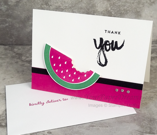
Watermelon thank you

So here's the next thing I made a pile of….. using not only the same colors and watermelon stamp from June's kit, but a sentiment from April's Paper Pumpkin kit, along with a "wreath" die from Santa's Sleigh Thinlits. (The die proved perfect for taking a "bite" out of the watermelon!) And having taken a queue from last year's "Pop of Pink" Designer Series Paper (retired), I've come to really love pairing Melon Mambo with Basic Black. Talk about making a statement! So a strip of each color anchors the bottom of the card, and the watermelon and sentiment elements are then balanced with a set of 3 small rhinestones. A very basic card with a big helping of sass, don'tcha think?

Oh, and did you know that if you're already a subscriber to Paper Pumpkin you can get a refill for the consumable elements of the kit? (While supplies last, that is.)  As of today, the refill for June's kit is still available in my online store here – for only $8 US.

My first Stampin’ Up! sampler

Spring sampler 2017_1

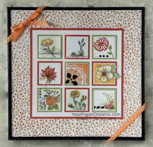
Well it finally happened. My first 12" x 12" framed sampler. 

Not that I haven't adored all the gorgeous themed samples I've seen through the years; I guess I was just a little intimidated. But I finally bit the bullet last week, put together a color palette inspired by Fruit Stand DSP, and dug in. I hit a creativity roadblock after the first 7 squares, so I lost a bit of time 'cuz of that, but at least I got the project finished on the same day I started it.

Ironically, I think the hardest thing about this was getting a half-way decent picture, lol! It's been raining, cloudy and dark around here for days, and since I shoot under natural light…. well, there just hasn't been any. So I ultimately decided to just run with what I had, and maybe someday, should we ever see the sun again, I'll try for a better shot then!

Here's what my thinking went like when planning this:

  • Size - well, I already had the 12 x 12 frame, which I'd purchased a number of months ago. So that was a no-brainer.
  • Color Palette – primarily inspired by the Fruit Stand DSP collection (Tangerine Tango, Peekaboo Peach, Pear Pizzazz, Whisper White), and I substituted So Saffron for Daffodil Delight, then added Soft Sky (for some of the backgrounds) & Basic Black for punch. (Every square has both white and black in it.) I even used 2 pieces of the DSP itself.
  • Theme – flowers & nature
  • Dimension – I knew I wanted "some", but had to keep it modest because this would be displayed behind glass. (You can go all kinds of crazy with dimension if you're using a shadow box, though….. and I'm anxious to do one of those one of these days, too.)
  • Techniques – I also wanted to showcase a variety of techniques, as well, so I was deliberate about doing something different with each square as I developed it.

Each decorated square is 1-7/8" square (Whisper White CS or watercolor paper), which is then mounted on a 2" square of Whisper White, and then mounted on either a Pear Pizzazz or Tangerine Tango 2-1/4" square. I first laid out the pattern for the largest layers, then stamped the 9 decorated squares, mounted each to its white backing, and then spent quite a bit of time experimenting with overall arrangements before anchoring them down to their colored backgrounds.

Can't wait to do my next one!

Fruit Stand Designer Series Paper

DSP Fruit Stand 1 wwm

DSP Fruitstand single wwm

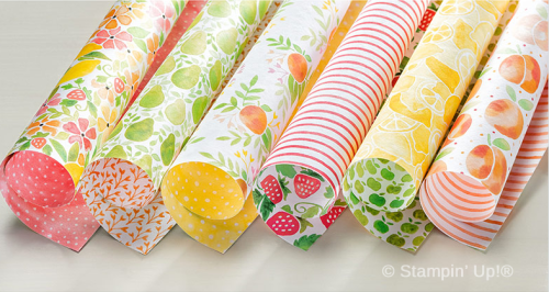
One of my favorite Designer Series papers in the Annual Catalog this year is the Fruit Stand DSP.  And even though we're heading into the season of more subdued colors, I still find myself being pulled back towards the fresh and happy colors of this delicious sherbet-inspired palette!  


141660G

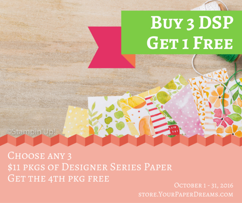
So lucky thing, isn't it, that during the month of October, for every 3 ($11 US) packages of Designer Series Paper you choose, you can get the 4th one FREE!?!


Buy 3, Get 1 free


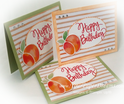
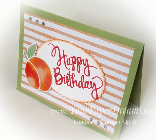
These cards were pretty darn simple to make. Two of the samples feature Pear Pizzaz cardstock for the base, and I used a sponge brayer to apply Peekaboo Peach ink onto thick Whisper White cardstock for the other one. I stamped "Happy Birthday" with Watermelon Wonder onto a piece of Whisper White, and then cut it out with one of the new "Layering Ovals Framelits". A little more Peekaboo Peach ink highlighted the edge.

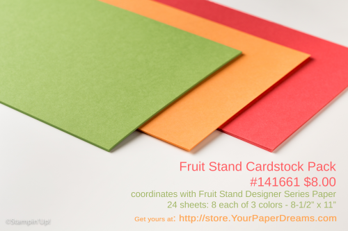
Fruit stand cardstock 2

The peach itself is just fussy-cut right from the DSP, and then both the oval and the peach are lifted up on Stampin' Dimensionals…. placed onto a piece of the very same Designer Series Paper (actually, the reverse side of the peaches). 

And then a bit of rhinestone bling, and it's done! Just THINK of how many fruit-filled birthday wishes you could make & send with just these very same products!

 Product List 

Designing with Bits and Pieces – Part 3

20160918_110821[1]-wwm

20160918_111918[1]-wwm


This is the last of the Bits & Pieces design session that I'll be sharing from my personal stamp-a-thon last weekend.  

Bits and pieces 3 wo arrows

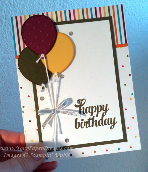
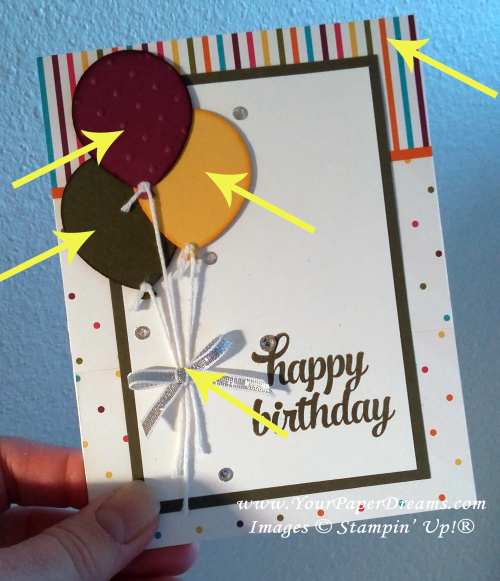
This one began centered around balloons because my scrap bag already held the Rich Razzleberry balloon (already punched and embossed), and it also had scraps of the two other colors of cardstock – each one just about the perfect size for a punched balloon. So the 3 balloons together quickly became my focal point….. but then I had to figure out where to go from there!

Further digging in my scrap bag turned up this scrap of striped Designer Series Paper (of the narrow-ish width you see here), and fortunately I was able to find a complementary piece of DSP (the polka dots) I could trim to go along with it. Placing the balloons directly on top of the printed backgrounds tended to wash them out, so the next 2 layers were born – to provide a simple white surface for the sentiment and focal point.

One more dive into my scrap bag brought me the silver bow, which I set off with a few rhinestones for a little extra bling. 

The arrows below show the 5 elements I was able to rescue from my "left-overs" scrap bag! Yee haw!!

Bits and pieces 3


Designing with Bits & Pieces

20160918_110821[1]-wwm


A little while ago I decided it was time to empty out and do something with some of the little "bits & pieces" I collect. You see, when I clean up my work space (which I seem to do far too rarely, but don't tell anyone, lol), I often find little leftover "bits & pieces" from a kit or Paper Pumpkin project I assembled, or some extra doo-dad from a card class I held, or something from a card design that got started once-upon-a-time and may have taken another direction – or just never got finished at all. So I keep a couple plastic bags on my desk and add those little tidbits to them at clean-up time.

So I decided recently it was time to pare down the contents of those bags a bit and see how I might actually USE some of those collected bits. I started by emptying out the bags and surveying what was there. (This is a partial sampling.)


20160918_111918[1]-wwm

From there, I started moving things around into little groupings of stuff that might go together…. whether by color and/or by theme – and several of those groupings eventually became the seeds for a card design.  I'll be highlighting some of the results in upcoming posts.

Here's the first completed card….. something that's been hanging around ever since last Christmas-stamping season. I've taken it out and looked at it from time to time during this past year, but just kept hitting a creative block. The concept had started out as a "black & gold" card. I remember being really excited about the somewhat different and elegant concept, and I'd made respectable progress on the card nearly a year ago - until I got totally stuck. Could NOT for the life of me figure out where it should go next! While the black & gold seemed pretty enough, it was just – well, boring.  I knew it needed a focal point, and that's the role the wreath was to play, but it still just wouldn't "work". 

So fast-forward nearly a year, and I finally figured out what the problem was. The volumes of each color where too similar….. often a no-no when planning a design. So I decided the answer might be to add a small amount of red for a bit of punch…… and here's what I ended up with.! I'm MUCH happier with it now!


20160925_155800[1]

20160925_155844[1]

Since this card had been "under construction" for the better part of a year, I didn't have to add much to it. As it turned out, I added a circle of Whisper White cardstock behind the wreath so the printed vellum underneath didn't show through…. and then I stamped and embossed the sentiment in red and fussy-cut its custom shape. Then I die-cut the bow from a scrap of red foil paper, and added a single rhinestone for bling. The arrows below show the only elements I actually added to what I'd started a long, long time ago! 

20160925_155722[1]

Stay tuned for more completed projects that have arisen recently out of my "bits and pieces" endeavor!

And in the meantime, if you're a FB friend and/or a regular customer of mine, I hope you'll join us for our 3rd annual World Card-Making Day Virtual Retreat! Hosted on Facebook, it'll be 48 hours of creativity and fun – from the comfort of your own home. (Although you DON'T have to be present for the entire time, of course!) So make sure you RSVP that you're attending (details are in the FB Event), and then gather up the goodies you plan to work with! And we'll see you in only a few more days!

World Card-Making Day 2016 - FB promo

Thoughtful Branches – Redux

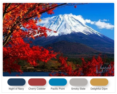
TAMS Color Builder (1)This is the most recent color challenge I've proposed in my Facebook groups. For my own card I knew I wanted to make a birthday card, but the colors were speaking to me more about "fall" than "birthday balloons" or the like. So I sucked it up and recreated this card – in new colors.

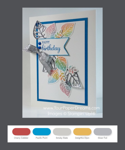
Using 4 of the 5 challenge colors, plus adding silver, I ended up with this:

Thoughtful Branches redux

Since most of these colors are quite bright (at least compared to the more traditional autumn colors of my original card), I chose to use sponges to apply the colors with this version – rather than the daubers of before. So this way I was able to soften the color intensity somewhat. But the larger surface of the sponges also meant more color-overlap, and I was reminded of a lesson I learned way back in elementary school: blue + yellow = green, lol!

I did, however, use one sponge dauber on this card – to apply the blue edge to the banner.

Now, as to the Thoughtful Branches Bundle (stamps & dies) that were *supposed* to be available only through the end of August….. well, at the end of August Stampin' Up!® announced they still had plenty in inventory, so they would continue to make them available while supplies lasted. And as of today, I see they're still in the online store! So if you haven't yet taken advantage of this amazingly gorgeous and versatile bundle, you're not out of luck – YET!  <<wink>>


How to coordinate your entire party’s colors – the easy way

Today I wanted to share a tip for making your party-planning a tad easier.

Choose Stampin' Up! colors for your event's color palette!

65th anniversary party - color coordination

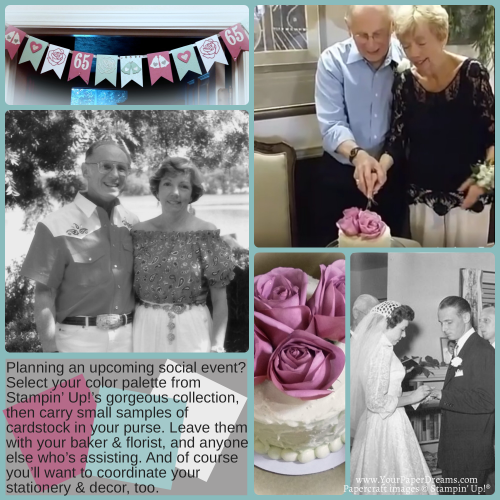
Last month my parents celebrated their 65th wedding anniversary. Yep, you read that right. 65 years!

Certainly worthy of a giant celebration - but unfortunately they no longer live near most of their friends, and family is spread all over the country these days, too. And neither are really "up to" a big party anyway. 

So our small group of family here in the area told 'em we'd come have dinner with them that night, and that's the only part of the "party" we told 'em about. The rest of it was kept a secret. But behind the scenes I planned a long-distance party, and at dinner that evening we explained that family and friends from all across the country were online that night to celebrate with them- via the internet! So we broadcast parts of our activities here on this end (via Facebook Live), and other family and friends posted memories and good wishes via Facebook – comments, pictures and videos, and sent cards (via my mailing address so I could snag 'em and package them all up in a handmade box). We had "party guests" ranging from close to their own ages…. all the way down to a new great-granddaughter just a couple of weeks old. It was fabulous!

The only part I was sad to note when it was all over, however, was a lack of still pictures….. because we'd relied so heavily on Facebook Live video to share the local activities in real time. I *was* able to snag a few screen shots from the videos afterwards, but it's been a bit tough documenting it afterwards with so few still pictures. (Lesson learned for next time.)

But back to my tip. I've been relying on this "Stick with Stampin' Up! colors" concept for a long, long time. And in fact my son's wedding was all done in Stampin' Up! colors over 10 years ago. All the way from the "Save the date" cards, to the invitations, printed programs, cake, decorations and flowers – to, yes, even the color of the bridesmaids dresses. And it made it SO easy to keep everything coordinated!

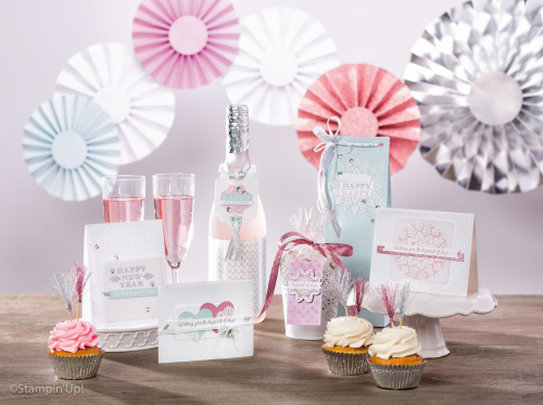
So of course when it came time to pull together THIS event for my parents, naturally I turned to Stampin' Up! again.  In fact, my inspiration came from the new Holiday Catalog…. and the Fancy Frost suite (shown on pages 35 & 36).  

Holiday16_p36a-19

 65th anniversary party colors

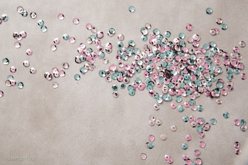
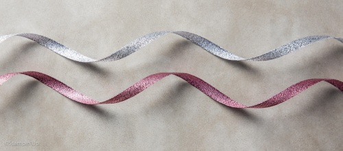
And of course we added a generous sprinkling of glitter (even edible glitter on the cake – but from the bakery, however), and Dazzling Diamonds glimmer paper…..


Dazzling Diamonds Glimmer Paper

 
Dazzling Diamonds Stampin' Glitter


 and other bling……

Holiday16_142549-23


Holiday16_142015-22 

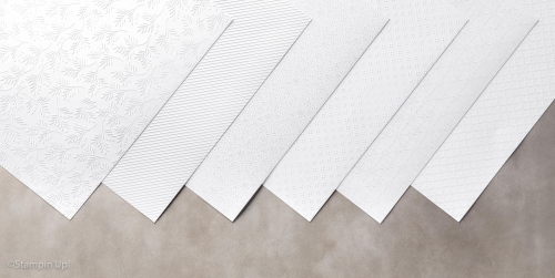
….. along with texture from the Fancy Frost Specialty Designer Series Paper.


Holiday16_142014-21


And I gave cardstock samples of the colors to the baker, and used 'em to coordinate flower arrangements, and was grateful I had a few extra pieces in my purse so I could grab a steal on a couple of "Sweet Sugarplum" mums for the dinner table when I just happened to walk by them one day and they called out to me!

So next time you're in charge of some kind of shindig, select your color palette from Stampin' Up!'s gorgeous choices and put several cardstock samples in your purse to keep 'em handy. It'll certainly make the "coordinating colors" element of your party a breeze!

Thoughtful Branches – Fall Leaves

20160826_170259wm

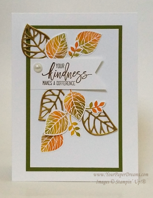
Yep, this time it's a fall card! Again, a "Lynda version" of a card that's been all over the 'net, and I loved the contrast between the die-cut lacy leaves and the solid, multi-color ones. Some versions of this card "out there" use a fun, but rather messy inking technique. But since I had designed my version for class, "messy" wasn't something I particularly wanted to tackle.

20160826_170259-562wm

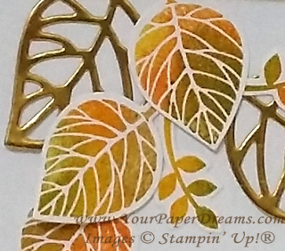
So here's how WE got a similar multi-color, autumn effect.  It's a pattern that you repeat for each individual image:


  • Start with a clean stamp. (Good idea to keep a damp paper towel handy.)
  • Ink up the stamp with Daffodil Delight, but do not stamp with it yet.
  • Lay out all your remaining leaf color inks in order from light to dark, left to right, and have a sponge dauber at hand for each one. (At my class we laid out Pumpkin Pie, Old Olive & Soft Suede.)
  • Onto your yellow-inked stamp, "daub" (is that a real word?!?) a couple of other colors directly onto small areas of the stamp….. one at a time, and always working from lightest to darkest. So because of the order we'd laid out the inks, that would mean Pumpkin Pie followed by Old Olive, OR Old Olive and then Soft Suede.  Pay attention to where you daub each color on the stamp so you don't overlap sections entirely.
  • Once that was done, there would be 3 colors on the stamp (Daffodil Delight + 2 others), and after "huffing" on it, it was time to stamp the image (onto a scrap of Whisper White cardstock).
  • Clean the stamp and get ready to repeat the process for the next leaf.

We stamped (and then die-cut) enough of these colored leaves for not only the front of the card, but also one or more for the inside, too. 

And we followed the same process for those little "flowery-leafy-thingies", too. 

After layering up the main pieces on the card front, we made the banner with the sentiment and anchored that in place…..

And then the lacy-leaves (cut with the corresponding stem-and-leaves die from this bundle – from Gold Foil paper) were laid in place to give a general shape to the layout. And finally, all pieces were tacked down with either strategically-placed dots of glue from the Fine Tip glue pen or the Tombow Multipurpose glue. (Repeat after me, Lynda's cardinal rule of glue-use:  "Less is more. Less is more. Less is more!")

A large (retired) pearl finished it off (and ensured it would cost an additional 21-cents to mail)!

Fall leaves card

Thoughtful Branches – A spring/summer hydrangea

2

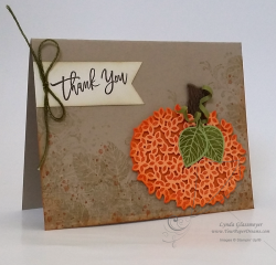
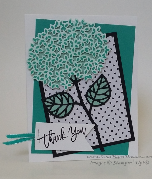
At my card classes earlier this month we capitalized on the versatility of the Thoughtful Branches Photopolymer Bundle and stamped up cards representing spring/summer, fall and winter. (See an additional fall card here.) Today I'd like to share our spring/summer card. Isn't it fascinating how the same stamp/die combo turned one way and stamped in orange can be a pumpkin….

20160826_170500-800wm

 yet  flipped over and stamped in a different color becomes a hydrangea?!?  Yes, I do believe this bundle from Stampin' Up!® is truly one of the top most creative and versatile they've produced. And I'm so sad that in only 3 more days it will go away. 

20160826_170354-wm

The color palette for this card is simple and fresh - generally monochromatic with its Whisper White, Basic Black, Pool Party & Bermuda Bay. The basic idea was something I'd seen online, but then I added my own tweaks, including the jaunty angles of the layers for an extra punch of fun.

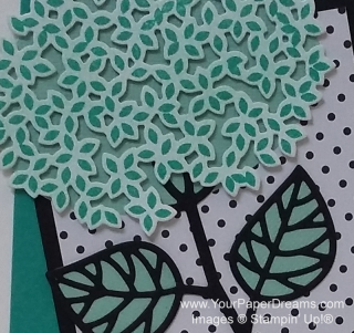
For the hydrangea, we first tinted a piece of Whisper White cardstock a light shade of Pool Party with one of our new sponge brayers.  Then stamped over that with Bermuda Bay before die-cutting that wonderful lacy shape. Then layered that piece over an oval (of Pool Party cardstock) to provide the sense of dimension…. just as I'd done with the pumpkin.

20160826_170354-800wm

The stem & leaf were die-cut as well (Basic Black), and the stem adhered to the underneath oval with tiny spots from the Fine-tip glue pen. To back the leaves, we traced the shape of the die itself onto scraps of Pool Party and cut them out by hand before adhering behind the detailed black layer. The black polka-dotted layer comes from Pop of Pink Specialty Designer Series Paper, a HOT DSP package found in the still-newish annual catalog. (You can never have too many polka dots, can you? And when they're black they go with EVERYTHING!)

And here's a fuss-free tip for cutting a banner exactly the right length for your sentiment:

  1. Cut a piece of cardstock as wide as you wish your finished banner to be, and plenty longer than you want its finished length to be.
  2. Notch one end with the Banner Triple Punch.
  3. Orient the notched edge according to your ultimate design, and stamp your sentiment close to the notch.
  4.  Then clip off any extra length – to yield a perfectly-sized stamped banner!

Stay tuned for the "fall" and "winter" examples -  from our card classes earlier this month!

  Product List


Thoughtful Branches – one of my all-time favorite bundles ever!

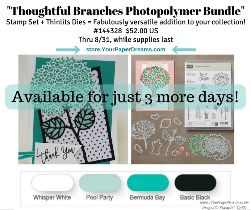
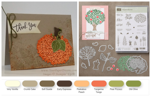
This month I've been in love. In love with what has got to be one of Stampin' Up!'s most versatile stamp set & dies bundles ever offered! And wouldn't you know it's only going to be available to the public for just THIS month – of August 2016!?!

If you haven't already seen this bundle all over the 'net, I suppose that means you must not have been ON the 'net, because it's everywhere you look – shown in amazing creative and colorful designs.  Um, but wait, wait! Please don't head off to Pinterest quite yet; you'll probably want to finish reading what I've got here for ya first!

Thoughtful Branches Bundle

This bundle is truly unique. Not shown or available in any catalog, it's only been available during August 2016…. and *will* be only while supplies last – through the 31st. (Fingers crossed that inventories will hold out that long, but you never know.) With 23 photopolymer stamps, and 9 coordinating Thinlits dies, and amazing versatility in its design, this is one bundle you'll definitely want to add to your collection if you haven't snagged it already. 

At my card classes earlier in the month, all 3 designs featured this set of stamps & dies – as we made a spring/summer card, a fall card, and a winter card. (Watch for those 3 designs to post in the upcoming days.)

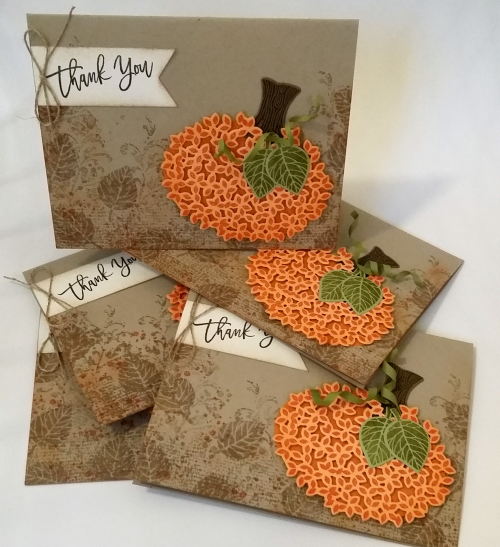
But then when I needed a pile of thank-you notes for my August orders, I once again turned to this bundle…. and made up the card shown here.

  20160826_170500-800wm


Actually, I got on a roll and made several of 'em.

20160827_164019_in_progress20160827_185945

You may also notice that in addition to the Thoughtful Branches Bundle, I also used Timeless Textures in the background.  (Another very worthwhile stamp set to own.)

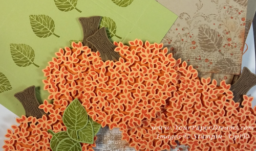
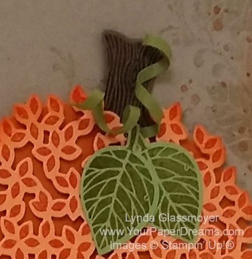
I have also fielded some questions about how I created the "tendrils" (curly-cues) at the top of the pumpkin. That's actually a 1/8" wide piece of Old Olive cardstock, wound around a skewer to shape the spiral. Then I snipped the curled piece in half and glued one end of each piece at the base of the pumpkin "stem" (which is really an upside-down tree trunk stamp & die).

Behind the die-cut fancy layer of Peekaboo Peach cardstock with Tangerine Tango ink lies an oval piece of Pumpkin Pie cardstock. Tiny snips of Stampin' Dimensionals hold the layers apart – to preserve the intricacies and detail of the die-cut layer.

20160826_170500-627wm


If you're still deciding whether or not you want this bundle, technically you still have through Wednesday the 31st, to call it yours. But why wait and run the risk of inventories running out before then? Claim both of these versatile selections here. I doubt you'll be sorry….